Can sea otters help kelp under a changing climate?

By Dominique Kone1 and Sara Hamilton2

1Masters Student in Marine Resource Management, 2Doctoral Student in Integrative Biology

Five years ago, the North Pacific Ocean experienced a sudden increase in sea surface temperature (SST), known as the warm blob, which altered marine ecosystem function and structure (Leising et al. 2015). Much research illustrated how the warm blob impacted pelagic ecosystems, with relatively less focused on the nearshore environment. Yet, a new study demonstrated how rising ocean temperatures have partially led to bull kelp loss in northern California. Unfortunately, we are once again observing similar warming trends, representing the second largest marine heatwave over recent decades, and signaling the potential rise of a second warm blob. Taken together, all these findings could forecast future warming-related ecosystem shifts in Oregon, highlighting the need for scientists and managers to consider strategies to prevent future kelp loss, such as reintroducing sea otters.

In northern California, researchers observed a dramatic ecosystem shift from productive bull kelp forests to purple sea urchin barrens. The study, led by Dr. Laura Rogers-Bennett from the University of California, Davis and California Department of Fish and Wildlife, determined that this shift was caused by multiple climatic and biological stressors. Beginning in 2013, sea star populations were decimated by sea star wasting disease (SSWD). Sea stars are a main predator of urchins, causing their absence to release purple urchins from predation pressure. Then, starting in 2014, ocean temperatures spiked with the warm blob. These two events created nutrient-poor conditions, which limited kelp growth and productivity, and allowed purple urchin populations to grow unchecked by predators and increase grazing on bull kelp. The combined effect led to approximately 90% reductions in bull kelp, with a reciprocal 60-fold increase in purple urchins (Figure 1).
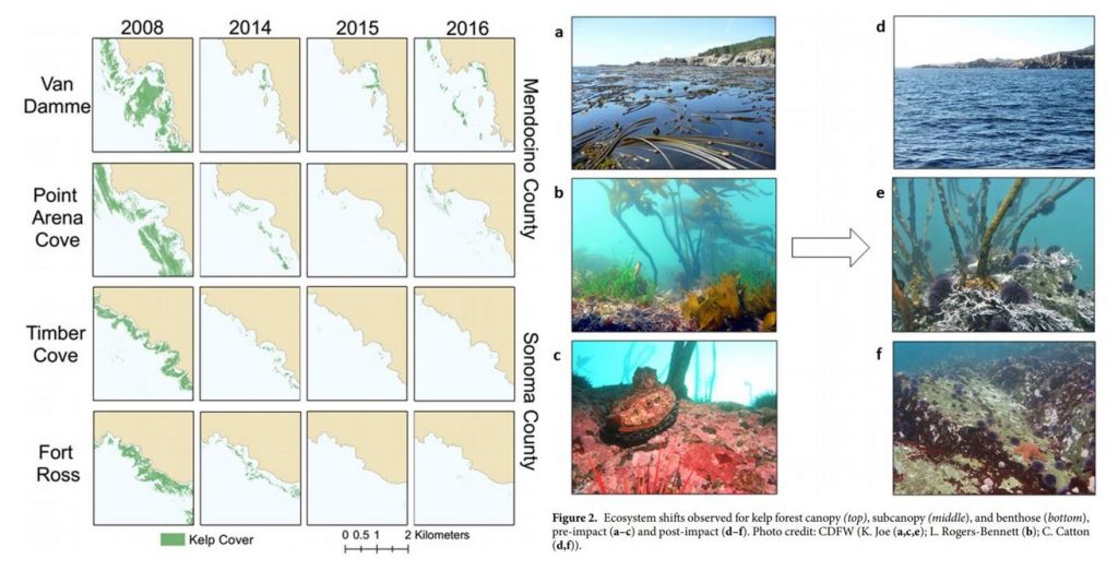
Figure 1. Kelp loss and ecosystem shifts in northern California (Rogers-Bennett & Catton 2019).

These changes have wrought economic challenges as well as ecological collapse in Northern California. Bull kelp is important habitat and food source for several species of economic importance including red abalone and red sea urchins (Tegner & Levin 1982). Without bull kelp, red abalone and red sea urchin populations have starved, resulting in the subsequent loss of the recreational red abalone ($44 million) and commercial red sea urchin fisheries in Northern California. With such large kelp reductions, purple urchins are also now in a starved state, evidenced by noticeably smaller gonads (Rogers-Bennett & Catton 2019).

Biogeographically, southern Oregon is very similar to northern California, as both are composed of complex rocky substrates and shorelines, bull kelp canopies, and benthic macroinvertebrates (i.e. sea urchins, abalone, etc.). Because Oregon was also impacted by the 2014-2015 warm blob and SSWD, we might expect to see a similar coastwide kelp forest loss along our southern coastline. The story is more complicated than that, however. For instance, ODFW has found purple urchin barrens where almost no kelp remains in some localized places. The GEMM Lab has video footage of purple urchins climbing up kelp stalks to graze within one of these barrens near Port Orford, OR (Figure 2, left). In her study, Dr. Rogers-Bennett explains that this aggressive sea urchin feeding strategy is potentially a sign of food limitation, where high-density urchin populations create intense resource competition. Conversely, at sites like Lighthouse Reef (~45 km from Port Orford) outside Charleston, OR, OSU and University of Oregon divers are currently seeing flourishing bull kelp forests. Urchins at this reef have fat, rich gonads, which is an indicator of high-quality nutrition (Figure 2, right).

Satellites can detect kelp on the surface of the water, giving scientists a way to track kelp extent over time. Preliminary results from Sara Hamilton’s Ph.D. thesis research finds that while some kelp forests have shrunk in past years, others are currently bigger than ever in the last 35 years. It is not clear what is driving this spatial variability in urchin and kelp populations, nor why southern Oregon has not yet faced the same kind of coastwide kelp forest collapse as northern California. Regardless, it is likely that kelp loss in both northern California and southern Oregon may be triggered and/or exacerbated by rising temperatures.
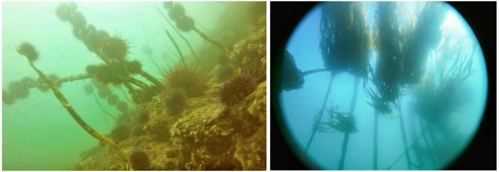
Figure 2. Left: Purple urchin aggressive grazing near Port Orford, OR (GEMM Lab 2019). Right: Flourishing bull kelp near Charleston, OR (Sara Hamilton 2019).

The reintroduction of sea otters has been proposed as a solution to combat rising urchin populations and bull kelp loss in Oregon. From an ecological perspective, there is some validity to this idea. Sea otters are a voracious urchin predator that routinely reduce urchin populations and alleviate herbivory on kelp (Estes & Palmisano 1974). Such restoration and protection of bull kelp could help prevent red abalone and red sea urchin starvation. Additionally, restoring apex predators and increasing species richness is often linked to increased ecosystem resilience, which is particularly important in the face of global anthropogenic change (Estes et al. 2011)

While sea otters could alleviate grazing pressure on Oregon’s bull kelp, this idea only looks at the issue from a top-down, not bottom-up, perspective. Sea otters require a lot of food (Costa 1978, Reidman & Estes 1990), and what they eat will always be a function of prey availability and quality (Ostfeld 1982). Just because urchins are available, doesn’t mean otters will eat them. In fact, sea otters prefer large and heavy (i.e. high gonad content) urchins (Ostfeld 1982). In the field, researchers have observed sea otters avoiding urchins at the center of urchin barrens (personal communication), presumably because those urchins have less access to kelp beds than on the barren periphery, and therefore, are constantly in a starved state (Konar & Estes 2003) (Figure 3). These findings suggest prey quality is more important to sea otter survival than just prey abundance.
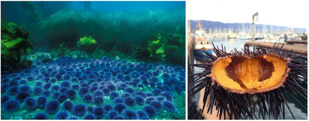
Figure 3. Left: Sea urchin barren (Annie Crawley). Right: Urchin gonads (Sea to Table).

Purple urchin quality has not been widely assessed in Oregon, but early results show that gonad size varies widely depending on urchin density and habitat type. In places where urchin barrens have formed, like Port Orford, purple urchins are likely starving and thus may be a poor source of nutrition for sea otters. Before we decide whether sea otters are a viable tool to combat kelp loss, prey surveys may need to be conducted to assess if a sea otter population could be sustained based on their caloric requirements. Furthermore, predictions of how these prey populations may change due to rising temperatures could help determine the potential for sea otters to become reestablished in Oregon under rapid environmental change.

Recent events in California could signal climate-driven processes that are already impacting some parts of Oregon and could become more widespread. Dr. Rogers-Bennett’s study is valuable as she has quantified and described ecosystem changes that might occur along Oregon’s southern coastline. The resurgence of a potential second warm blob and the frequency between these warming events begs the question if such temperature spikes are still anomalous or becoming the norm. If the latter, we could see more pronounced kelp loss and major shifts in nearshore ecosystem baselines, where function and structure is permanently altered. Whether reintroducing sea otters can prevent these changes will ultimately depend on prey and habitat availability and quality, and should be carefully considered.

References:

Costa, D. P. 1978. The ecological energetics, water, and electrolyte balance of the California sea otter (Enhydra lutris). Ph.D. dissertation, University of California, Santa Cruz.

Estes, J. A. and J.F. Palmisano. 1974. Sea otters: their role in structuring nearshore communities. Science. 185(4156): 1058-1060.

Estes et al. 2011. Trophic downgrading of planet Earth. Science. 333(6040): 301-306.

Harvell et al. 2019. Disease epidemic and a marine heat wave are associated with the continental-scale collapse of a pivotal predator (Pycnopodia helianthoides). Science Advances. 5(1).

Konar, B., and J. A. Estes. 2003. The stability of boundary regions between kelp beds and deforested areas. Ecology. 84(1): 174-185.

Leising et al. 2015. State of California Current 2014-2015: impacts of the warm-water “blob”. CalCOFI Reports. (56): 31-68.

Ostfeld, R. S. 1982. Foraging strategies and prey switching in the California sea otter. Oecologia. 53(2): 170-178.

Reidman, M. L. and J. A. Estes. 1990. The sea otter (Enhydra lutris): behavior, ecology, and natural history. United States Department of the Interior, Fish and Wildlife Service, Biological Report. 90: 1-126.

Rogers-Bennett, L., and C. A. Catton. 2019. Marine heat wave and multiple stressors tip bull kelp forest to sea urchin barrens. Scientific Reports. 9:15050.

Tegner, M. J., and L. A. Levin. 1982. Do sea urchins and abalones compete in California? International Echinoderms Conference, Tampa Bay. J. M Lawrence, ed.

The significance of blubber hormone sampling in conservation and monitoring of marine mammals

By: Alexa Kownacki, Ph.D. Student, OSU Department of Fisheries and Wildlife, Geospatial Ecology of Marine Megafauna Lab

Marine mammals are challenging to study for many reasons, and specifically because they inhabit the areas of the Earth that are uninhabited by people: the oceans. Monitoring marine mammal populations to gather baselines on their health condition and reproductive status is not as simple as trap and release, which is a method often conducted for terrestrial animals. Marine mammals are constantly moving in vast areas below the surface. Moreover, cetaceans, which do not spend time on land, are arguably the most challenging to sample.

One component of my project, based in California, USA, is a health assessment analyzing hormones of the bottlenose dolphins that frequent both the coastal and the offshore waters. Therefore, I am all too familiar with the hurdles of collecting health data from living marine mammals, especially cetaceans. However, the past few decades have seen major advancements in technology both in the laboratory and with equipment, including one tool that continues to be critical in understanding cetacean health: blubber biopsies.

Biopsy dart hitting a bottlenose dolphin below the dorsal fin. Image Source: NMFS

Blubber biopsies are typically obtained via low-powered crossbow with a bumper affixed to the arrow to de-power it once it hits the skin. The arrow tip has a small, pronged metal attachment to collect an eraser-tipped size amount of tissue with surface blubber and skin. I compare this to a skin punch biopsies in humans; it’s small, minimally-invasive, and requires no follow-up care. With a small team of scientists, we use small, rigid-inflatable vessels to survey the known locations of where the bottlenose dolphins tend to gather. Then, we assess the conditions of the seas and of the animals, first making sure we are collecting from animals without potentially lowered immune systems (no large, visible wounds) or calves (less than one years old). Once we have photographed the individual’s dorsal fin to identify the individual, one person assembles the biopsy dart and crossbow apparatus following sterile procedures when attaching the biopsy tips to avoid infection. Another person prepares to photograph the animal to match the biopsy information to the individual dolphin. One scientist aims the crossbow for the body of the dolphin, directly below the dorsal fin, while the another photographs the biopsy dart hitting the animal and watches where it bounces off. Then, the boat maneuvers to the floating biopsy dart to recover the dart and the sample. Finally, the tip with blubber and skin tissue is collected, again using sterile procedures, and the sample is archived for further processing. A similar process, using an air gun instead of a crossbow can be viewed below:

GEMM Lab members using an air gun loaded with a biopsy dart to procure marine mammal blubber from a blue whale in New Zealand. Video Source: GEMM Laboratory.

Part of the biopsy process is holding ourselves to the highest standards in our minimally-invasive technique, which requires constant practice, even on land.

Alexa practicing proper crossbow technique on land under supervision. Image Source: Alexa Kownacki

Blubber is the lipid-rich, vascularized tissue under the epidermis that is used in thermoregulation and fat storage for marine mammals. Blubber is an ideal matrix for storing lipophilic (fat-loving) steroid hormones because of its high fat content. Steroid hormones, such as cortisol, progesterone, and testosterone, are naturally circulating in the blood stream and are released in high concentrations during specific events. Unlike blood, blubber is less dynamic and therefore tells a much longer history of the animal’s nutritional state, environmental exposure, stress level, and life history status. Blubber is the cribs-notes version of a marine mammal’s biography over its previous few months of life. Blood, on the other hand, is the news story from the last 24 hours. Both matrices serve a specific purpose in telling the story, but blubber is much more feasible to obtain from a cetacean and provides a longer time frame in terms of information on the past.

A simplified depiction of marine mammal blubber starting from the top (most exterior surface) being the skin surface down to the muscle (most interior). Image Source: schoolnet.org.za

I use blubber biopsies for assessing cortisol, testosterone, and progesterone in the bottlenose dolphins. Cortisol is a glucocorticoid that is frequently associated with stress, including in humans. Marine mammals utilize the same hypothalamic-pituitary-adrenal (HPA) axis that is responsible for the fight-or-flight response, as well as other metabolic regulations. During prolonged stressful events, cortisol levels will remain elevated, which has long-term repercussions for an animal’s health, such as lowered immune systems and decreased ability to respond to predators. Testosterone and progesterone are sex hormones, which can be used to indicate sex of the individual and determine reproductive status. This reproductive information allows us to assess the population’s composition and structure of males and females, as well as potential growth or decline in population (West et al. 2014).

Alexa using a crossbow from a small boat off of San Diego, CA. Image Source: Alexa Kownacki

The coastal and offshore bottlenose dolphin ecotypes of interest in my research occupy different locations and are therefore exposed to different health threats. This is a primary reason for conducting health assessments, specifically analyzing blubber hormone levels. The offshore ecotype is found many kilometers offshore and is most often encountered around the southern Channel Islands. In contrast, the coastal ecotype is found within 2 kilometers of shore (Lowther-Thieleking et al. 2015) where they are subjected to more human exposure, both directly and indirectly, because of their close proximity to the mainland of the United States. Coastal dolphins have a higher likelihood of fishery-related mortality, the negative effects of urbanization including coastal runoff and habitat degradation, and recreational activities (Hwang et al. 2014). The blubber hormone data from my project will inform which demographics are most at-risk. From this information, I can provide data supporting why specific resources should be allocated differently and therefore help vulnerable populations. Further proving that the small amount of tissue from a blubber biopsy can help secure a better future for population by adjusting and informing conservation strategies.

Literature Cited:

Hwang, Alice, Richard H Defran, Maddalena Bearzi, Daniela. Maldini, Charles A Saylan, Aime ́e R Lang, Kimberly J Dudzik, Oscar R Guzo n-Zatarain, Dennis L Kelly, and David W Weller. 2014. “Coastal Range and Movements of Common Bottlenose Dolphins (Tursiops Truncatus) off California and Baja California, Mexico.” Bulletin of the Southern California Academy of Sciences 113 (1): 1–13. https://doi.org/10.3390/toxins6010211.

Lowther-Thieleking, Janet L., Frederick I. Archer, Aimee R. Lang, and David W. Weller. 2015. “Genetic Differentiation among Coastal and Offshore Common Bottlenose Dolphins, Tursiops Truncatus, in the Eastern North Pacific Ocean.” Marine Mammal Science 31 (1): 1–20. https://doi.org/10.1111/mms.12135.

West, Kristi L., Jan Ramer, Janine L. Brown, Jay Sweeney, Erin M. Hanahoe, Tom Reidarson, Jeffry Proudfoot, and Don R. Bergfelt. 2014. “Thyroid Hormone Concentrations in Relation to Age, Sex, Pregnancy, and Perinatal Loss in Bottlenose Dolphins (Tursiops Truncatus).” General and Comparative Endocrinology 197: 73–81. https://doi.org/10.1016/j.ygcen.2013.11.021.

Zooming in: A closer look at bottlenose dolphin distribution patterns off of San Diego, CA

By: Alexa Kownacki, Ph.D. Student, OSU Department of Fisheries and Wildlife, Geospatial Ecology of Marine Megafauna Lab

Data analysis is often about parsing down data into manageable subsets. My project, which spans 34 years and six study sites along the California coast, requires significant data wrangling before full analysis. As part of a data analysis trial, I first refined my dataset to only the San Diego survey location. I chose this dataset for its standardization and large sample size; the bulk of my sightings, over 4,000 of the 6,136, are from the San Diego survey site where the transect methods were highly standardized. In the next step, I selected explanatory variable datasets that covered the sighting data at similar spatial and temporal resolutions. This small endeavor in analyzing my data was the first big leap into understanding what questions are feasible in terms of variable selection and analysis methods. I developed four major hypotheses for this San Diego site.

The study species: common bottlenose dolphin (Tursiops truncatus) seen along the California coastline in 2015. Image source: Alexa Kownacki.

Hypotheses:

H1: I predict that bottlenose dolphin sightings along the San Diego transect throughout the years 1981-2015 exhibit clustered distribution patterns as a result of the patchy distributions of both the species’ preferred habitats, as well as the social nature of bottlenose dolphins.

H2: I predict there would be higher densities of bottlenose dolphin at higher latitudes spanning 1981-2015 due to prey distributions shifting northward and less human activities in the northerly sections of the transect.

H3: I predict that during warm (positive) El Niño Southern Oscillation (ENSO) months, the dolphin sightings in San Diego would be distributed more northerly, predominantly with prey aggregations historically shifting northward into cooler waters, due to (secondarily) increasing sea surface temperatures.

H4: I predict that along the San Diego coastline, bottlenose dolphin sightings are clustered within two kilometers of the six major lagoons, with no specific preference for any lagoon, because the murky, nutrient-rich waters in the estuarine environments are ideal for prey protection and known for their higher densities of schooling fishes.

Data Description:

The common bottlenose dolphin (Tursiops truncatus) sighting data spans 1981-2015 with a few gap years. Sightings cover all months, but not in all years sampled. The same transect in San Diego was surveyed in a small, rigid-hulled inflatable boat with approximately a two-kilometer observation area (one kilometer surveyed 90 degrees to starboard and port of the bow).

I wanted to see if there were changes in dolphin distribution by latitude and, if so, whether those changes had a relationship to ENSO cycles and/or distances to lagoons. For ENSO data, I used the NOAA database that provides positive, neutral, and negative indices (1, 0, and -1, respectively) by each month of each year. I matched these ENSO data to my month-date information of dolphin sighting data. Distance from each lagoon was calculated for each sighting.

Figure 1. Map representing the San Diego transect, represented with a light blue line inside of a one-kilometer buffered “sighting zone” in pale yellow. The dark pink shapes are dolphin sightings from 1981-2015, although some are stacked on each other and cannot be differentiated. The lagoons, ranging in size, are color-coded. The transect line runs from the breakwaters of Mission Bay, CA to Oceanside Harbor, CA.

Results: 

H1: True, dolphins are clustered and do not have a uniform distribution across this area. Spatial analysis indicated a less than a 1% likelihood that this clustered pattern could be the result of random chance (Fig. 1, z-score = -127.16, p-value < 0.0001). It is well-known that schooling fishes have a patchy distribution, which could influence the clustered distribution of their dolphin predators. In addition, bottlenose dolphins are highly social and although pods change in composition of individuals, the dolphins do usually transit, feed, and socialize in small groups.

Figure 2. Summary from the Average Nearest Neighbor calculation in ArcMap 10.6 displaying that bottlenose dolphin sightings in San Diego are highly clustered. When the z-score, which corresponds to different colors on the graphic above, is strongly negative (< -2.58), in this case dark blue, it indicates clustering. Because the p-value is very small, in this case, much less than 0.01, these results of clustering are strongly significant.

H2: False, dolphins do not occur at higher densities in the higher latitudes of the San Diego study site. The sightings are more clumped towards the lower latitudes overall (p < 2e-16), possibly due to habitat preference. The sightings are closer to beaches with higher human densities and human-related activities near Mission Bay, CA. It should be noted, that just north of the San Diego transect is the Camp Pendleton Marine Base, which conducts frequent military exercises and could deter animals.

Figure 3. Histogram comparing the latitudes with the frequency of dolphin sightings in San Diego, CA. The x-axis represents the latitudinal difference from the most northern part of the transect to each dolphin sighting. Therefore, a small difference would translate to a sighting being in the northern transect areas whereas large differences would translate to sightings being more southerly. This could be read from left to right as most northern to most southern. The y-axis represents the frequency of which those differences are seen, that is, the number of sightings with that amount of latitudinal difference, or essentially location on the transect line. Therefore, you can see there is a peak in the number of sightings towards the southern part of the transect line.

H3: False, during warm (positive) El Niño Southern Oscillation (ENSO) months, the dolphin sightings in San Diego were more southerly. In colder (negative) ENSO months, the dolphins were more northerly. The differences between sighting latitude and ENSO index was significant (p<0.005). Post-hoc analysis indicates that the north-south distribution of dolphin sightings was different during each ENSO state.

Figure 4. Boxplot visualizing distributions of dolphin sightings latitudinal differences and ENSO index, with -1,0, and 1 representing cold, neutral, and warm years, respectively.

H4: True, dolphins are clustered around particular lagoons. Figure 5 illustrates how dolphin sightings nearest to Lagoon 6 (the San Dieguito Lagoon) are always within 0.03 decimal degrees. Because of how these data are formatted, decimal degrees is the easiest way to measure change in distance (in this case, the difference in latitude). In comparison, dolphins at Lagoon 5 (Los Penasquitos Lagoon) are distributed across distances, with the most sightings further from the lagoon.

Figure 5. Bar plot displaying the different distances from dolphin sighting location to the nearest lagoon in San Diego in decimal degrees. Note: Lagoon 4 is south of the study site and therefore was never the nearest lagoon.

I found a significant difference between distance to nearest lagoon in different ENSO index categories (p < 2.55e-9): there is a significant difference in distance to nearest lagoon between neutral and negative values and positive and neutral years. Therefore, I hypothesize that in neutral ENSO months compared to positive and negative ENSO months, prey distributions are changing. This is one possible hypothesis for the significant difference in lagoon preference based on the monthly ENSO index. Using a violin plot (Fig. 6), it appears that Lagoon 5, Los Penasquitos Lagoon, has the widest variation of sighting distances in all ENSO index conditions. In neutral years, Lagoon 0, the Buena Vista Lagoon has multiple sightings, when in positive and negative years it had either no sightings or a single sighting. The Buena Vista Lagoon is the most northerly lagoon, which may indicate that in neutral ENSO months, dolphin pods are more northerly in their distribution.

Figure 6. Violin plot illustrating the distance from lagoons of dolphin sightings under different ENSO conditions. There are three major groups based on ENSO index: “-1” representing cold years, “0” representing neutral years, and “1” representing warm years. On the x-axis are lagoon IDs and on the y-axis is the distance to the nearest lagoon in decimal degrees. The wider the shapes, the more sightings, therefore Lagoon 6 has many sightings within a very small distance compared to Lagoon 5 where sightings are widely dispersed at greater distances.


Bottlenose dolphins foraging in a small group along the California coast in 2015. Image source: Alexa Kownacki.

Takeaways to science and management: 

Bottlenose dolphins have a clustered distribution which seems to be related to ENSO monthly indices, and likely, their social structures. From these data, neutral ENSO months appear to have something different happening compared to positive and negative months, that is impacting the sighting distributions of bottlenose dolphins off the San Diego coastline. More research needs to be conducted to determine what is different about neutral months and how this may impact this dolphin population. On a finer scale, the six lagoons in San Diego appear to have a spatial relationship with dolphin sightings. These lagoons may provide critical habitat for bottlenose dolphins and/or for their preferred prey either by protecting the animals or by providing nutrients. Different lagoons may have different spans of impact, that is, some lagoons may have wider outflows that create larger nutrient plumes.

Other than the Marine Mammal Protection Act and small protected zones, there are no safeguards in place for these dolphins, whose population hovers around 500 individuals. Therefore, specific coastal areas surrounding lagoons that are more vulnerable to habitat loss, habitat degradation, and/or are more frequented by dolphins, may want greater protection added at a local, state, or federal level. For example, the Batiquitos and San Dieguito Lagoons already contain some Marine Conservation Areas with No-Take Zones within their reach. The city of San Diego and the state of California need better ways to assess the coastlines in their jurisdictions and how protecting the marine, estuarine, and terrestrial environments near and encompassing the coastlines impacts the greater ecosystem.

This dive into my data was an excellent lesson in spatial scaling with regards to parsing down my data to a single study site and in matching my existing data sets to other data that could help answer my hypotheses. Originally, I underestimated the robustness of my data. At first, I hesitated when considering reducing the dolphin sighting data to only include San Diego because I was concerned that I would not be able to do the statistical analyses. However, these concerns were unfounded. My results are strongly significant and provide great insight into my questions about my data. Now, I can further apply these preliminary results and explore both finer and broader scale resolutions, such as using the more precise ENSO index values and finding ways to compare offshore bottlenose dolphin sighting distributions.

Current gray whale die-off: a concern or simply the circle of life?

By Leila Lemos, PhD Candidate in Wildlife Sciences, Fisheries and Wildlife Department / OSU

Examination of a dead gray whale found in Pacifica, California, in May 2019.
Source: CNN 2019.


The avalanche of news on gray whale deaths this year is everywhere. And because my PhD thesis focuses on gray whale health, I’ve been asked multiple times now why this is happening. So, I thought it was a current and important theme to explore in our blog. The first question that comes to (my) mind is: is this a sad and unusual event for the gray whales that raises concern, or is this die-off event expected and simply part of the circle of life?

At least 64 gray whales have washed-up on the West Coast of the US this year, including the states of California, Oregon and Washington. According to John Calambokidis, biologist and founder of the Cascadia Research Collective, the washed-up whales had one thing in common: all were in poor body condition, potentially due to starvation (Calambokidis in: Paris 2019). Other than looking skinny, some of the whale carcasses also presented injuries, apparently caused by ship strikes (CNN 2019).

Cascadia Research Collective examining a dead gray whale in 9 May 2019, washed up in Washington state. Cause of death was not immediately apparent but appeared consistent with nutritional stress.
Source: Cascadia Research Collective 2019.

To give some context, gray whales migrate long distances while they fast for long periods. They are known for performing the longest migration ever seen for a mammal, as they travel up to 20,000 km roundtrip every year from their breeding grounds in Baja California, Mexico, to their feeding grounds in the Bering and Chukchi seas (Calambokidis et al. 2002, Jones and Swartz 2002, Sumich 2014). Thus, a successful feeding season is critical for energy replenishment to recover from the previous migration and fasting periods, and for energy storage to support their metabolic needsduring the migration and fasting periods that follow. An unsuccessful feeding season could likely result in poor body condition, affecting individual performance in the following seasons, a phenomenon known as the carry-over effect(Harrison et al., 2011).

In addition, environmental change, such as climate variations, might impact shifts in prey availability and thus intensify energetic demands on the whales as they need to search harder and longer for food. These whales already fast for months and spend large energy reserves supporting their migrations. When they arrive at their feeding grounds, they need to start feeding. If they don’t have access to predictable food sources, their fitness is affected and they become more vulnerable to anthropogenic threats, including ship strikes, entanglement in fishery gear, and contamination.

For the past three years, I have been using drone-based photogrammetry to assess gray whale body condition along the Oregon coast, as part of my PhD project. Coincident to this current die-off event, I have observed that these whales presented good body condition in 2016, but in the past two years their condition has worsened. But these Oregon whales are feeding on different prey in different areas than the rest of the ENP that heads up to the Bering Sea to feed. So, are all gray whales suffering from the same broad scale environmental impacts? I am currently looking into environmental remote sensing data such as sea surface temperature, chlorophyll-a and upwelling index to explore associations between body condition and environmental anomalies that could be associated.

Trying to answer the question I previously mentioned “is this event worrisome or natural?”, I would estimate that this die-off is mostly due to natural patterns, mainly as a consequence of ecological patterns. This Eastern North Pacific (ENP) gray whale population is now estimated at 27,000 individuals (Calambokidis in: Paris 2019) and it has been suggested that this population is currently at its carrying capacity(K), which is estimated to be between 19,830 and 28,470 individuals (Wade and Perryman, 2002). Prey availability on their primary foraging grounds in the Bering Sea may simply not be enough to sustain this whole population.

The plot below illustrates a population in exponential growth over the years. The population reaches a point (K) that the system can no longer support. Therefore, the population declines and then fluctuates around this K point. This pattern and cycle can result in die-off events like the one we are currently witnessing with the ENP gray whale population.

Population at a carrying capacity (K)
Source: Conservation of change 2019.


According to the American biologist Paul Ehrlich: “the idea that we can just keep growing forever on a finite planet is totally imbecilic”. Resources are finite, and so are populations. We should expect die-off events like this.

Right now, we are early on the 2019 feeding season for these giant migrators. Mortality numbers are likely to increase and might even exceed previous die-off events. The last ENP gray whale die-off event occurred in the 1999-2000 season, when a total of 283 stranded whales in 1999 and 368 in 2000 were found displaying emaciated conditions (Gulland et al. 2005). This last die-off event occurred 20 years ago, and thus in my opinion, it is too soon to raise concerns about the long-term impacts on the ENP gray whale population, unless this event continues over multiple years.


References

Calambokidis, J. et al. 2002. Abundance, range and movements of a feeding aggregation of gray whales (Eschrichtius robustus) from California to southeastern Alaska in 1998. Journal of Cetacean research and Management. 4, 267-276.

Cascadia Research Collective (2019, May 10). Cascadia and other Washington stranding network organizations continue to respond to growing number of dead gray whales along our coast and inside waters. Retrieved from http://www.cascadiaresearch.org/washington-state-stranding-response/cascadia-and-other-washington-stranding-networkorganizations?fbclid=Iw AR1g7zc4EOMWr_wp_x39ertvzpjOnc1zZl7DoMbBcjI1Ic_EbUx2bX8_TBw

Conservation of change (2019, May 31). Limits to Growth: the first law of sustainability. Retrieved from http://www.conservationofchange.org/limits

CNN (2019, May 15). Dead gray whales keep washing ashore in the San Francisco Bay area.Retrieved from https://www.cnn.com/2019/05/15/us/gray-whale-deaths-trnd-sci/index.html

Gulland, F. M. D., H. Pérez-Cortés M., J. Urbán R., L. Rojas-Bracho, G. Ylitalo, J. Weir, S. A. Norman, M. M. Muto, D. J. Rugh, C. Kreuder, and T. Rowles. 2005. Eastern North Pacific gray whale (Eschrichtius robustus) unusual mortality event, 1999-2000. U. S. Dep. Commer., NOAA Tech. Memo. NMFS-AFSC-150, 33 p.

Harrison, X. A., et al., 2011. Carry-over effects as drivers of fitness differences in animals. Journal of Animal Ecology. 80, 4-18.

Jones, M. L., Swartz, S. L., Gray Whale, Eschrichtius robustus. Encyclopedia of Marine Mammals. Academic Press, San Diego, 2002, pp. 524-536.

Paris (2019, May 27). Gray Whales Wash Up On West Coast At Near-Record Levels.Retrieved from https://www.wbur.org/hereandnow/2019/05/27/gray-whales-wash-up-record-levels

Sumich, J. L., 2014. E. robustus: The biology and human history of gray whales. Whale Cove Marine Education.

Wade, P. R., Perryman, W., An assessment of the eastern gray whale population in 2002. IWC, Vol. SC/54/BRG7 Shimonoseki, Japan, 2002, pp. 16.


Data Wrangling to Assess Data Availability: A Data Detective at Work

By Alexa Kownacki, Ph.D. Student, OSU Department of Fisheries and Wildlife, Geospatial Ecology of Marine Megafauna Lab

Data wrangling, in my own loose definition, is the necessary combination of both data selection and data collection. Wrangling your data requires accessing then assessing your data. Data collection is just what it sounds like: gathering all data points necessary for your project. Data selection is the process of cleaning and trimming data for final analyses; it is a whole new bag of worms that requires decision-making and critical thinking. During this process of data wrangling, I discovered there are two major avenues to obtain data: 1) you collect it, which frequently requires an exorbitant amount of time in the field, in the lab, and/or behind a computer, or 2) other people have already collected it, and through collaboration you put it to a good use (often a different use then its initial intent). The latter approach may result in the collection of so much data that you must decide which data should be included to answer your hypotheses. This process of data wrangling is the hurdle I am facing at this moment. I feel like I am a data detective.

Data wrangling illustrated by members of the R-programming community. (Image source: R-bloggers.com)

My project focuses on assessing the health conditions of the two ecotypes of bottlenose dolphins between the waters off of Ensenada, Baja California, Mexico to San Francisco, California, USA between 1981-2015. During the government shutdown, much of my data was inaccessible, seeing as it was in possession of my collaborators at federal agencies. However, now that the shutdown is over, my data is flowing in, and my questions are piling up. I can now begin to look at where these animals have been sighted over the past decades, which ecotypes have higher contaminant levels in their blubber, which animals have higher stress levels and if these are related to geospatial location, where animals are more susceptible to human disturbance, if sex plays a role in stress or contaminant load levels, which environmental variables influence stress levels and contaminant levels, and more!

Alexa, alongside collaborators, photographing transiting bottlenose dolphins along the coastline near Santa Barbara, CA in 2015 as part of the data collection process. (Image source: Nick Kellar).

Over the last two weeks, I was emailed three separate Excel spreadsheets representing three datasets, that contain partially overlapping data. If Microsoft Access is foreign to you, I would compare this dilemma to a very confusing exam question of “matching the word with the definition”, except with the words being in different languages from the definitions. If you have used Microsoft Access databases, you probably know the system of querying and matching data in different databases. Well, imagine trying to do this with Excel spreadsheets because the databases are not linked. Now you can see why I need to take a data management course and start using platforms other than Excel to manage my data.

A visual interpretation of trying to combine datasets being like matching the English definition to the Spanish translation. (Image source: Enchanted Learning)

In the first dataset, there are 6,136 sightings of Common bottlenose dolphins (Tursiops truncatus) documented in my study area. Some years have no sightings, some years have fewer than 100 sightings, and other years have over 500 sightings. In another dataset, there are 398 bottlenose dolphin biopsy samples collected between the years of 1992-2016 in a genetics database that can provide the sex of the animal. The final dataset contains records of 774 bottlenose dolphin biopsy samples collected between 1993-2018 that could be tested for hormone and/or contaminant levels. Some of these samples have identification numbers that can be matched to the other dataset. Within these cross-reference matches there are conflicting data in terms of amount of tissue remaining for analyses. Sorting these conflicts out will involve more digging from my end and additional communication with collaborators: data wrangling at its best. Circling back to what I mentioned in the beginning of this post, this data was collected by other people over decades and the collection methods were not standardized for my project. I benefit from years of data collection by other scientists and I am grateful for all of their hard work. However, now my hard work begins.

The cutest part of data wrangling: finding adorable images of bottlenose dolphins, photographed during a coastal survey. (Image source: Alexa Kownacki).

There is also a large amount of data that I downloaded from federally-maintained websites. For example, dolphin sighting data from research cruises are available for public access from the OBIS (Ocean Biogeographic Information System) Sea Map website. It boasts 5,927,551 records from 1,096 data sets containing information on 711 species with the help of 410 collaborators. This website is incredible as it allows you to search through different data criteria and then download the data in a variety of formats and contains an interactive map of the data. You can explore this at your leisure, but I want to point out the sheer amount of data. In my case, the OBIS Sea Map website is only one major platform that contains many sources of data that has already been collected, not specifically for me or my project, but will be utilized. As a follow-up to using data collected by other scientists, it is critical to give credit where credit is due. One of the benefits of using this website, is there is information about how to properly credit the collaborators when downloading data. See below for an example:

Example citation for a dataset (Dataset ID: 1201):

Lockhart, G.G., DiGiovanni Jr., R.A., DePerte, A.M. 2014. Virginia and Maryland Sea Turtle Research and Conservation Initiative Aerial Survey Sightings, May 2011 through July 2013. Downloaded from OBIS-SEAMAP (http://seamap.env.duke.edu/dataset/1201) on xxxx-xx-xx.

Citation for OBIS-SEAMAP:

Halpin, P.N., A.J. Read, E. Fujioka, B.D. Best, B. Donnelly, L.J. Hazen, C. Kot, K. Urian, E. LaBrecque, A. Dimatteo, J. Cleary, C. Good, L.B. Crowder, and K.D. Hyrenbach. 2009. OBIS-SEAMAP: The world data center for marine mammal, sea bird, and sea turtle distributions. Oceanography 22(2):104-115

Another federally-maintained data source that boasts more data than I can quantify is the well-known ERDDAP website. After a few Google searches, I finally discovered that the acronym stands for Environmental Research Division’s Data Access Program. Essentially, this the holy grail of environmental data for marine scientists. I have downloaded so much data from this website that Excel cannot open the csv files. Here is yet another reason why young scientists, like myself, need to transition out of using Excel and into data management systems that are developed to handle large-scale datasets. Everything from daily sea surface temperatures collected on every, one-degree of latitude and longitude line from 1981-2015 over my entire study site to Ekman transport levels taken every six hours on every longitudinal degree line over my study area. I will add some environmental variables in species distribution models to see which account for the largest amount of variability in my data. The next step in data selection begins with statistics. It is important to find if there are highly correlated environmental factors prior to modeling data. Learn more about fitting cetacean data to models here.

The ERDAPP website combined all of the average Sea Surface Temperatures collected daily from 1981-2018 over my study site into a graphical display of monthly composites. (Image Source: ERDDAP)

As you can imagine, this amount of data from many sources and collaborators is equal parts daunting and exhilarating. Before I even begin the process of determining the spatial and temporal spread of dolphin sightings data, I have to identify which data points have sex identified from either hormone levels or genetics, which data points have contaminants levels already quantified, which samples still have tissue available for additional testing, and so on. Once I have cleaned up the datasets, I will import the data into the R programming package. Then I can visualize my data in plots, charts, and graphs; this will help me identify outliers and potential challenges with my data, and, hopefully, start to see answers to my focal questions. Only then, can I dive into the deep and exciting waters of species distribution modeling and more advanced statistical analyses. This is data wrangling and I am the data detective.

What people may think a ‘data detective’ looks like, when, in reality, it is a person sitting at a computer. (Image source: Elder Research)

Like the well-known phrase, “With great power comes great responsibility”, I believe that with great data, comes great responsibility, because data is power. It is up to me as the scientist to decide which data is most powerful at answering my questions.

Data is information. Information is knowledge. Knowledge is power. (Image source: thedatachick.com)


Science (or the lack thereof) in the Midst of a Government Shutdown

By Alexa Kownacki, Ph.D. Student, OSU Department of Fisheries and Wildlife, Geospatial Ecology of Marine Megafauna Lab

In what is the longest government shutdown in the history of the United States, many people are impacted. Speaking from a scientist’s point of view, I acknowledge the scientific community is one of many groups that is being majorly obstructed. Here at the GEMM Laboratory, all of us are feeling the frustrations of the federal government grinding to a halt in different ways. Although our research spans great distances—from Dawn’s work on New Zealand blue whales that utilizes environmental data managed by our federal government, to new projects that cannot get federal permit approvals to state data collection, to many of Leigh’s projects on the Oregon coast of the USA that are funded and collaborate with federal agencies—we all recognize that our science is affected by the shutdown. My research on common bottlenose dolphins is no exception; my academic funding is through the US Department of Defense, my collaborators are NOAA employees who contribute NOAA data; I use publicly-available data for additional variables that are government-maintained; and I am part of a federally-funded public university. Ironically, my previous blog post about the intersection of science and politics seems to have become even more relevant in the past few weeks.

Many graduate students like me are feeling the crunch as federal agencies close their doors and operations. Most people have seen the headlines that allude to such funding-related issues. However, it’s important to understand what the funding in question is actually doing. Whether we see it or not, the daily operations of the United States Federal government helps science progress on a multitude of levels.

Federal research in the United States is critical. Most governmental branches support research with the most well-known agencies for doing so being the National Science Foundation (NSF), the US Department of Agriculture (USDA), the National Oceanic and Atmospheric Administration (NOAA), and the National Aeronautics and Space Administration. There are 137 executive agencies in the USA (cei.org). On a finer scale, NSF alone receives approximately 40,000 scientific proposals each year (nsf.gov).

If I play a word association game and I am given the word “science”, my response would be “data”. Data—even absence data—informs science. The largest aggregate of metadata with open resources lives in the centralized website, data.gov, which is maintained by the federal government and is no longer accessible and directs you to this message:Here are a few more examples of science that has stopped in its track from lesser-known research entities operated by the federal government:

Currently, the National Weather Service (NWS) is unable to maintain or improve its advanced weather models. Therefore, in addition to those of us who include weather or climate aspects into our research, forecasters are having less and less information on which to base their weather predictions. Prior to the shutdown, scientists were changing the data format of the Global Forecast System (GFS)—the most advanced mathematical, computer-based weather modeling prediction system in the USA. Unfortunately, the GFS currently does not recognize much of the input data it is receiving. A model is only as good as its input data (as I am sure Dawn can tell you), and currently that means the GFS is very limited. Many NWS models are upgraded January-June to prepare for storm season later in the year. Therefore, there are long-term ramifications for the lack of weather research advancement in terms of global health and safety. (https://www.washingtonpost.com/weather/2019/01/07/national-weather-service-is-open-your-forecast-is-worse-because-shutdown/?noredirect=on&utm_term=.5d4c4c3c1f59)

An example of one output from the GFS model. (Source: weather.gov)

The Food and Drug Administration (FDA)—a federal agency of the Department of Health and Human Services—that is responsible for food safety, has reduced inspections. Because domestic meat and poultry are at the highest risk of contamination, their inspections continue, but by staff who are going without pay, according to the agency’s commissioner, Dr. Scott Gottlieb. Produce, dry foods, and other lower-risk consumables are being minimally-inspected, if at all.  Active research projects investigating food-borne illness that receive federal funding are at a standstill.  Is your stomach doing flips yet? (https://www.nytimes.com/2019/01/09/health/shutdown-fda-food-inspections.html?rref=collection%2Ftimestopic%2FFood%20and%20Drug%20Administration&action=click&contentCollection=timestopics&region=stream&module=stream_unit&version=latest&contentPlacement=2&pgtype=collection)

An FDA field inspector examines imported gingko nuts–a process that is likely not happening during the shutdown. (Source: FDA.gov)

The National Parks Service (NPS) recently made headlines with the post-shutdown acts of vandalism in the iconic Joshua Tree National Park. What you might not know is that the shutdown has also stopped a 40-year study that monitors how streams are recovering from acid rain. Scientists are barred from entering the park and conducting sampling efforts in remote streams of Shenandoah National Park, Virginia. (http://www.sciencemag.org/news/2019/01/us-government-shutdown-starts-take-bite-out-science)

A map of the sampling sites that have been monitored since the 1980s for the Shenandoah Watershed Study and Virginia Trout Stream Sensitivity Study that cannot be accessed because of the shutdown. (Source: swas.evsc.virginia.edu)

NASA’s Stratospheric Observatory for Infrared Astronomy (SOFIA), better known as the “flying telescope” has halted operations, which will require over a week to bring back online upon funding restoration. SOFIA usually soars into the stratosphere as a tool to study the solar system and collect data that ground-based telescopes cannot. (http://theconversation.com/science-gets-shut-down-right-along-with-the-federal-government-109690)

NASA’s Stratospheric Observatory for Infrared Astronomy (SOFIA) flies over the snowy Sierra Nevada mountains while the telescope gathers information. (Source: NASA/ Jim Ross).

It is important to remember that science happens outside of laboratories and field sites; it happens at meetings and conferences where collaborations with other great minds brainstorm and discover the best solutions to challenging questions. The shutdown has stopped most federal travel. The annual American Meteorological Society Meeting and American Astronomical Society meeting were two of the scientific conferences in the USA that attract federal employees and took place during the shutdown. Conferences like these are crucial opportunities with lasting impacts on science. Think of all the impressive science that could have sparked at those meetings. Instead, many sessions were cancelled, and most major agencies had zero representation (https://spacenews.com/ams-2019-overview/). Topics like lidar data applications—which are used in geospatial research, such as what the GEMM Laboratory uses in some its projects, could not be discussed. The cascade effects of the shutdown prove that science is interconnected and without advancement, everyone’s research suffers.

It should be noted, that early-career scientists are thought to be the most negatively impacted by this shutdown because of financial instability and job security—as well as casting a dark cloud on their futures in science: largely unknown if they can support themselves, their families, and their research. (https://eos.org/articles/federal-government-shutdown-stings-scientists-and-science). Graduate students, young professors, and new professionals are all in feeling the pressure. Our lives are based on our research. When the funds that cover our basic research requirements and human needs do not come through as promised, we naturally become stressed.

An adult and a juvenile common bottlenose dolphin, forage along the San Diego coastline in November 2018. (Source: Alexa Kownacki)

So, yes, funding—or the lack thereof—is hurting many of us. Federally-funded individuals are selling possessions to pay for rent, research projects are at a standstill, and people are at greater health and safety risks. But, also, science, with the hope for bettering the world and answering questions and using higher thinking, is going backwards. Every day without progress puts us two days behind. At first glance, you may not think that my research on bottlenose dolphins is imperative to you or that the implications of the shutdown on this project are important. But, consider this: my study aims to quantify contaminants in common bottlenose dolphins that either live in nearshore or offshore waters. Furthermore, I study the short-term and long-term impacts of contaminants and other health markers on dolphin hormone levels. The nearshore common bottlenose dolphin stocks inhabit the highly-populated coastlines that many of us utilize for fishing and recreation. Dolphins are mammals, that respond to stress and environmental hazards, in similar ways to humans. So, those blubber hormone levels and contamination results, might be more connected to your health and livelihood than at first glance. The fact that I cannot download data from ERDDAP, reach my collaborators, or even access my data (that starts in the early 1980s), does impact you. Nearly everyone’s research is connected to each other’s at some level, and that, in turn has lasting impacts on all people—scientists or not. As the shutdown persists, I continue to question how to work through these research hurdles. If anything, it has been a learning experience that I hope will end soon for many reasons—one being: for science.

Why Feeling Stupid is Great: How stupidity fuels scientific progress and discovery

By Alexa Kownacki, Ph.D. Student, OSU Department of Fisheries and Wildlife, Geospatial Ecology of Marine Megafauna Lab

It all started with a paper. On Halloween, I sat at my desk, searching for papers that could answer my questions about bottlenose dolphin metabolism and realized I had forgotten to check my email earlier. In my inbox, there was a new message with an attachment from Dr. Leigh Torres to the GEMM Lab members, saying this was a “must-read” article. The suggested paper was Martin A. Schwartz’s 2008 essay, “The importance of stupidity in scientific research”, published in the Journal of Cell Science, highlighted universal themes across science. In a single, powerful page, Schwartz captured my feelings—and those of many scientists: the feeling of being stupid.

For the next few minutes, I stood at the printer and absorbed the article, while commenting out loud, “YES!”, “So true!”, and “This person can see into my soul”. Meanwhile, colleagues entered my office to see me, dressed in my Halloween costume—as “Amazon’s Alexa”, talking aloud to myself. Coincidently, I was feeling pretty stupid at that moment after just returning from a weekly meeting, where everyone asked me questions that I clearly did not have the answers to (all because of my costume). This paper seemed too relevant; the timing was uncanny. In the past few weeks, I have been writing my PhD research proposal —a requirement for our department— and my goodness, have I felt stupid. The proposal outlines my dissertation objectives, puts my work into context, and provides background research on common bottlenose dolphin health. There is so much to know that I don’t know!

Alexa dressed as “Amazon Alexa” on Halloween at her office in San Diego, CA.

When I read Schwartz’s 2008 paper, there were a few takeaway messages that stood out:

  1. People take different paths. One path is not necessarily right nor wrong. Simply, different. I compared that to how I split my time between OSU and San Diego, CA. Spending half of the year away from my lab and my department is incredibly challenging; I constantly feel behind and I miss the support that physically being with other students provides. However, I recognize the opportunities I have in San Diego where I work directly with collaborators who teach and challenge me in new ways that bring new skills and perspective.

    Image result for different ways
    (Image source: St. Albert’s Place)
  2. Feeling stupid is not bad. It can be a good feeling—or at least we should treat it as being a positive thing. It shows we have more to learn. It means that we have not reached our maximum potential for learning (who ever does?). While writing my proposal I realized just how little I know about ecotoxicology, chemistry, and statistics. I re-read papers that are critical to understanding my own research, like “Nontargeted biomonitoring of halogenated organic compounds in two ecotypes of bottlenose dolphins (Tursiops truncatus) from the Southern California bight” (2014) by Shaul et al. and “Bottlenose dolphins as indicators of persistent organic pollutants in the western north Atlantic ocean and northern gulf of Mexico” (2011) by Kucklick et al. These articles took me down what I thought were wormholes that ended up being important rivers of information. Because I recognized my knowledge gap, I can now articulate the purpose and methods of analysis for specific compounds that I will conduct using blubber samples of common bottlenose dolphins

    Image result
    Image source: memegenerator.net
  3. Drawing upon experts—albeit intimidating—is beneficial for scientific consulting as well as for our mental health; no one person knows everything. That statement can bring us together because when people work together, everyone benefits. I am also reminded that we are our own harshest critics; sometimes our colleagues are the best champions of our own successes. It is also why historical articles are foundational. In the hunt for the newest technology and the latest and greatest in research, it is important to acknowledge the basis for discoveries. My data begins in 1981, when the first of many researchers began surveying the California coastline for common bottlenose dolphins. Geographic information systems (GIS) were different back then. The data requires conversions and investigative work. I had to learn how the data were collected and how to interpret that information. Therefore, it should be no surprise that I cite literature from the 1970s, such as “Results of attempts to tag Atlantic Bottlenose dolphins, (Tursiops truncatus)” by Irvine and Wells. Although published in 1972, the questions the authors tried to answer are very similar to what I am looking at now: how are site fidelity and home ranges impacted by natural and anthropogenic processes. While Irvine and Wells used large bolt tags to identify individuals, my project utilizes much less invasive techniques (photo-identification and blubber biopsies) to track animals, their health, and their exposures to contaminants.

    Image result for that is why you fail yoda
    (Image source: imgflip.com)
  4. Struggling is part of the solution. Science is about discovery and without the feeling of stupidity, discovery would not be possible. Feeling stupid is the first step in the discovery process: the spark that fuels wanting to explore the unknown. Feeling stupid can lead to the feeling of accomplishment when we find answers to those very questions that made us feel stupid. Part of being a student and a scientist is identifying those weaknesses and not letting them stop me. Pausing, reflecting, course correcting, and researching are all productive in the end, but stopping is not. Coursework is the easy part of a PhD. The hard part is constantly diving deeper into the great unknown that is research. The great unknown is simultaneously alluring and frightening. Still, it must be faced head on. Schwartz describes “productive stupidity [as] being ignorant by choice.” I picture this as essentially blindly walking into the future with confidence. Although a bit of an oxymoron, it resonates the importance of perseverance and conviction in the midst of uncertainty.

    Image result for funny t rex
    (Image source: Redbubble)

Now I think back to my childhood when stupid was one of the forbidden “s-words” and I question whether society had it all wrong. Maybe we should teach children to acknowledge ignorance and pursue the unknown. Stupid is a feeling, not a character flaw. Stupidity is important in science and in life. Fascination and emotional desires to discover new things are healthy. Next time you feel stupid, try running with it, because more often than not, you will learn something.

Image may contain: 1 person, sitting, table, child and outdoor
Alexa teaching about marine mammals to students ages 2-6 and learning from educators about new ways to engage young students. San Diego, CA in 2016. (Photo source: Lori Lowder)

The Recipe for a “Perfect” Marine Mammal and Seabird Cruise

By Alexa Kownacki, Ph.D. Student, OSU Department of Fisheries and Wildlife, Geospatial Ecology of Marine Megafauna Lab

Science—and fieldwork in particular—is known for its failures. There are websites, blogs, and Twitter pages dedicated to them. This is why, when things go according to plan, I rejoice. When they go even better than expected, I practically tear up from amazement. There is no perfect recipe for a great marine mammal and seabird research cruise, but I would suggest that one would look like this:

 A Great Marine Mammal and Seabird Research Cruise Recipe:

  • A heavy pour of fantastic weather
    • Light on the wind and seas
    • Light on the glare
  • Equal parts amazing crew and good communication
  • A splash of positivity
  • A dash of luck
  • A pinch of delicious food
  • Heaps of marine mammal and seabird sightings
  • Heat to approximately 55-80 degrees F and transit for 10 days along transects at 10-12 knots

The end of another beautiful day at sea on the R/V Shimada. Image source: Alexa K.

The Northern California Current Ecosystem (NCCE) is a highly productive area that is home to a wide variety of cetacean species. Many cetaceans are indicator species of ecosystem health as they consume large quantities of prey from different levels in trophic webs and inhabit diverse areas—from deep-diving beaked whales to gray whales traveling thousands of miles along the eastern north Pacific Ocean. Because cetacean surveys are a predominant survey method in large bodies of water, they can be extremely costly. One alternative to dedicated cetacean surveys is using other research vessels as research platforms and effort becomes transect-based and opportunistic—with less flexibility to deviate from predetermined transects. This decreases expenses, creates collaborative research opportunities, and reduces interference in animal behavior as they are never pursued. Observing animals from large, motorized, research vessels (>100ft) at a steady, significant speed (>10kts/hour), provides a baseline for future, joint research efforts. The NCCE is regularly surveyed by government agencies and institutions on transects that have been repeated nearly every season for decades. This historical data provides critical context for environmental and oceanographic dynamics that impact large ecosystems with commercial and recreational implications.

My research cruise took place aboard the 208.5-foot R/V Bell M. Shimada in the first two weeks of May. The cruise was designated for monitoring the NCCE with the additional position of a marine mammal observer. The established guidelines did not allow for deviation from the predetermined transects. Therefore, mammals were surveyed along preset transects. The ship left port in San Francisco, CA and traveled as far north as Cape Meares, OR. The transects ranged from one nautical mile from shore and two hundred miles offshore. Observations occurred during “on effort” which was defined as when the ship was in transit and moving at a speed above 8 knots per hour dependent upon sea state and visibility. All observations took place on the flybridge during conducive weather conditions and in the bridge (one deck below the flybridge) when excessive precipitation was present. The starboard forward quarter: zero to ninety degrees was surveyed—based on the ship’s direction (with the bow at zero degrees). Both naked eye and 7×50 binoculars were used with at least 30 percent of time binoculars in use. To decrease observer fatigue, which could result in fewer detected sightings, the observer (me) rotated on a 40 minutes “on effort”, 20 minutes “off effort” cycle during long transits (>90 minutes).

Alexa on-effort using binoculars to estimate the distance and bearing of a marine mammal sighted off the starboard bow. Image source: Alexa K.

Data was collected using modifications to the SEEbird Wincruz computer program on a ruggedized laptop and a GPS unit was attached. At the beginning of each day and upon changes in conditions, the ship’s heading, weather conditions, visibility, cloud cover, swell height, swell direction, and Beaufort sea state (BSS) were recorded. Once the BSS or visibility was worse than a “5” (1 is “perfect” and 5 is “very poor”) observations ceased until there was improvement in weather. When a marine mammal was sighted the latitude and longitude were recorded with the exact time stamp. Then, I noted how the animal was sighted—either with binoculars or naked eye—and what action was originally noticed—blow, splash, bird, etc. The bearing and distance were noted using binoculars. The animal was given three generalized behavior categories: traveling, feeding, or milling. A sighting was defined as any marine mammal or group of animals. Therefore, a single sighting would have the species and the best, high, and low estimates for group size.

By my definitions, I had the research cruise of my dreams. There were moments when I imagined people joining this trip as a vacation. I *almost* felt guilty. Then, I remember that after watching water for almost 14 hours (thanks to the amazing weather conditions), I worked on data and reports and class work until midnight. That’s the part that no one talks about: the data. Fieldwork is about collecting data. It’s both what I live for and what makes me nervous. The amount of time, effort, and money that is poured into fieldwork is enormous. The acquisition of the data is not as simple as it seems. When I briefly described my position on this research cruise to friends, they interpret it to be something akin to whale-watching. To some extent, this is true. But largely, it’s grueling hours that leave you fatigued. The differences between fieldwork and what I’ll refer to as “everything else” AKA data analysis, proposal writing, manuscript writing, literature reviewing, lab work, and classwork, are the unbroken smile, the vaguely tanned skin, the hours of laughter, the sea spray, and the magical moments that reassure me that I’ve chosen the correct career path.

Alexa photographing a gray whale at sunset near Newport, OR. Image source: Alexa K.

This cruise was the second leg of the Northern California Current Ecosystem (NCCE) survey, I was the sole Marine Mammal and Seabird Observer—a coveted position. Every morning, I would wake up at 0530hrs, grab some breakfast, and climb to the highest deck: the fly-bridge. Akin to being on the top of the world, the fly-bridge has the best views for the widest span. From 0600hrs to 2000hrs I sat, stood, or danced in a one-meter by one-meter corner of the fly-bridge and surveyed. This visual is why people think I’m whale watching. In reality, I am constantly busy. Nonetheless, I had weather and seas that scientists dream about—and for 10 days! To contrast my luck, you can read Florence’s blog about her cruise. On these same transects, in February, Florence experienced 20-foot seas with heavy rain with very few marine mammal sightings—and of those, the only cetaceans she observed were gray whales close to shore. That starkly contrasts my 10 cetacean species with upwards of 45 sightings and my 20-minute hammock power naps on the fly-bridge under the warm sun.

Pacific white-sided dolphins traveling nearby. Image source: Alexa K.

Marine mammal sightings from this cruise included 10 cetacean species: Pacific white-sided dolphin, Dall’s porpoise, unidentified beaked whale, Cuvier’s beaked whale, gray whale, Minke whale, fin whale, Northern right whale dolphin, blue whale, humpback whale, and transient killer whale and one pinniped species: northern fur seal. What better way to illustrate these sightings than with a map? We are a geospatial lab after all.

Cetacean Sightings on the NCCE Cruise in May 2018. Image source: Alexa K.

This map is the result of data collection. However, it does not capture everything that was observed: sea state, weather, ocean conditions, bathymetry, nutrient levels, etc. There are many variables that can be added to maps–like this one (thanks to my GIS classes I can start adding layers!)–that can provide a better understanding of the ecosystem, predator-prey dynamics, animal behavior, and population health.

The catch from a bottom trawl at a station with some fish and a lot of pyrosomes (pink tube-like creatures). Image source: Alexa K.

Being a Ph.D. student can be physically and mentally demanding. So, when I was offered the opportunity to hone my data collection skills, I leapt for it. I’m happiest in the field: the wind in my face, the sunshine on my back, surrounded by cetaceans, and filled with the knowledge that I’m following my passion—and that this data is contributing to the greater scientific community.

Humpback whale photographed traveling southbound. Image source: Alexa K.

The Land of Maps and Charts: Geospatial Ecology

By Alexa Kownacki, Ph.D. Student, OSU Department of Fisheries and Wildlife, Geospatial Ecology of Marine Megafauna Lab

I love maps. I love charts. As a random bit of trivia, there is a difference between a map and a chart. A map is a visual representation of land that may include details like topology, whereas a chart refers to nautical information such as water depth, shoreline, tides, and obstructions.

Map of San Diego, CA, USA. (Source: San Diego Metropolitan Transit System)

Chart of San Diego, CA, USA. (Source: NOAA)

I have an intense affinity for visually displaying information. As a child, my dad traveled constantly, from Barrow, Alaska to Istanbul, Turkey. Immediately upon his return, I would grab our standing globe from the dining room and our stack of atlases from the coffee table. I would sit at the kitchen table, enthralled at the stories of his travels. Yet, a story was only great when I could picture it for myself. (I should remind you, this was the early 1990s, GoogleMaps wasn’t a thing.) Our kitchen table transformed into a scene from Master and Commander—except, instead of nautical charts and compasses, we had an atlas the size of an overgrown toddler and salt and pepper shakers to pinpoint locations. I now had the world at my fingertips. My dad would show me the paths he took from our home to his various destinations and tell me about the topography, the demographics, the population, the terrain type—all attribute features that could be included in common-day geographic information systems (GIS).

Uncle Brian showing Alexa where they were on a map of Maui, Hawaii, USA. (Photo: Susan K. circa 1995)

As I got older, the kitchen table slowly began to resemble what I imagine the set from Master and Commander actually looked like; nautical charts, tide tables, and wind predictions were piled high and the salt and pepper shakers were replaced with pencil marks indicating potential routes for us to travel via sailboat. The two of us were in our element. Surrounded by visual and graphical representations of geographic and spatial information: maps. To put my map-attraction this in even more context, this is a scientist who grew up playing “Take-Off”, a board game that was “designed to teach geography” and involved flying your fleet of planes across a Mercator projection-style mapboard. Now, it’s no wonder that I’m a graduate student in a lab that focuses on the geospatial aspects of ecology.

A precocious 3-year-old Alexa, sitting with the airplane pilot asking him a long list of travel-related questions (and taking his captain’s hat). Photo: Susan K.

So why and how did geospatial ecology became a field—and a predominant one at that? It wasn’t that one day a lightbulb went off and a statistician decided to draw out the results. It was a progression, built upon for thousands of years. There are maps dating back to 2300 B.C. on Babylonian clay tablets (The British Museum), and yet, some of the maps we make today require highly sophisticated technology. Geospatial analysis is dynamic. It’s evolving. Today I’m using ArcGIS software to interpolate mass amounts of publicly-available sea surface temperature satellite data from 1981-2015, which I will overlay with a layer of bottlenose dolphin sightings during the same time period for comparison. Tomorrow, there might be a new version of software that allows me to animate these data. Heck, it might already exist and I’m not aware of it. This growth is the beauty of this field. Geospatial ecology is made for us cartophiles (map-lovers) who study the interdependency of biological systems where location and distance between things matters.

Alexa’s grandmother showing Alexa (a very young cartographer) how to color in the lines. Source: Susan K. circa 1994

In a broader context, geospatial ecology communicates our science to all of you. If I posted a bunch of statistical outputs in text or even table form, your eyes might glaze over…and so might mine. But, if I displayed that same underlying data and results on a beautiful map with color-coded symbology, a legend, a compass rose, and a scale bar, you might have this great “ah-ha!” moment. That is my goal. That is what geospatial ecology is to me. It’s a way to SHOW my science, rather than TELL it.

Would you like to see this over and over again…?

A VERY small glimpse into the enormous amount of data that went into this map. This screenshot gave me one point of temperature data for a single location for a single day…Source: Alexa K.

Or see this once…?

Map made in ArcGIS of Coastal common bottlenose dolphin sightings between 1981-1989 with a layer of average sea surface temperatures interpolated across those same years. A picture really is worth a thousand words…or at least a thousand data points…Source: Alexa K.

For many, maps are visually easy to interpret, allowing quick message communication. Yet, there are many different learning styles. From my personal story, I think it’s relatively obvious that I’m, at least partially, a visual learner. When I was in primary school, I would read the directions thoroughly, but only truly absorb the material once the teacher showed me an example. Set up an experiment? Sure, I’ll read the lab report, but I’m going to refer to the diagrams of the set-up constantly. To this day, I always ask for an example. Teach me a new game? Let’s play the first round and then I’ll pick it up. It’s how I learned to sail. My dad described every part of the sailboat in detail and all I heard was words. Then, my dad showed me how to sail, and it came naturally. It’s only as an adult that I know what “that blue line thingy” is called. Geospatial ecology is how I SEE my research. It makes sense to me. And, hopefully, it makes sense to some of you!

Alexa’s dad teaching her how to sail. (Source: Susan K. circa 2000)

Alexa’s first solo sailboat race in Coronado, San Diego, CA. Notice: Alexa’s dad pushing the bow off the dock and the look on Alexa’s face. (Source: Susan K. circa 2000)

Alexa mapping data using ArcGIS in the Oregon State University Library. (Source: Alexa K circa a few minutes prior to posting).

I strongly believe a meaningful career allows you to highlight your passions and personal strengths. For me, that means photography, all things nautical, the great outdoors, wildlife conservation, and maps/charts.  If I converted that into an equation, I think this is a likely result:

Photography + Nautical + Outdoors + Wildlife Conservation + Maps/Charts = Geospatial Ecology of Marine Megafauna

Or, better yet:

? + ⚓ + ? + ? + ? =  GEMM Lab

This lab was my solution all along. As part of my research on common bottlenose dolphins, I work on a small inflatable boat off the coast of California (nautical ✅, outdoors ✅), photograph their dorsal fin (photography ✅), and communicate my data using informative maps that will hopefully bring positive change to the marine environment (maps/charts ✅, wildlife conservation✅). Geospatial ecology allows me to participate in research that I deeply enjoy and hopefully, will make the world a little bit of a better place. Oh, and make maps.

Alexa in the field, putting all those years of sailing and chart-reading to use! (Source: Leila L.)