WHAT TO DO WHEN YOUR WEBSITE JUST DOESN’T RANK

We’ve all been there.

Logging hours of work building a webpage. Carefully crafting content, ensuring that it is both up-to-date and meaningful. Optimizing keywords, images, and links, to create the desired foundational elements. But no matter what we do, it always seems that the site rankings do not respond as we expect. Knowing that there are TENS OF THOUSANDS of searching happening each second, means we know that the potential to grow is there!

So, what have we missed? What about SEO analytics have we not considered? There are two elements you can consider that may make all the difference.

How secure is my website?

It doesn’t seem like the first element one would consider when looking to increase search ranking, but how secure and fast your website are key elements in both returning good rankings through Google’s SEO analytics, as well as keeping users coming back to your website.

HTTPS VS HTTP

A key SEO enhancement that will launch your rankings ahead is to make sure your website is secure through using HTTPS. HTTPS encrypts data of your website, ensuring that it is not changed or corrupted as it is transmitted. By switching from HTTP to HTTPS, not only do you provide a more safe and secure experience for your site visitors, but you also ensure Google includes that factor in your SEO Ranking and provide more accurate data on referral traffic to Google Analytics. Truly there is no disadvantage to taking the time to make the switch.
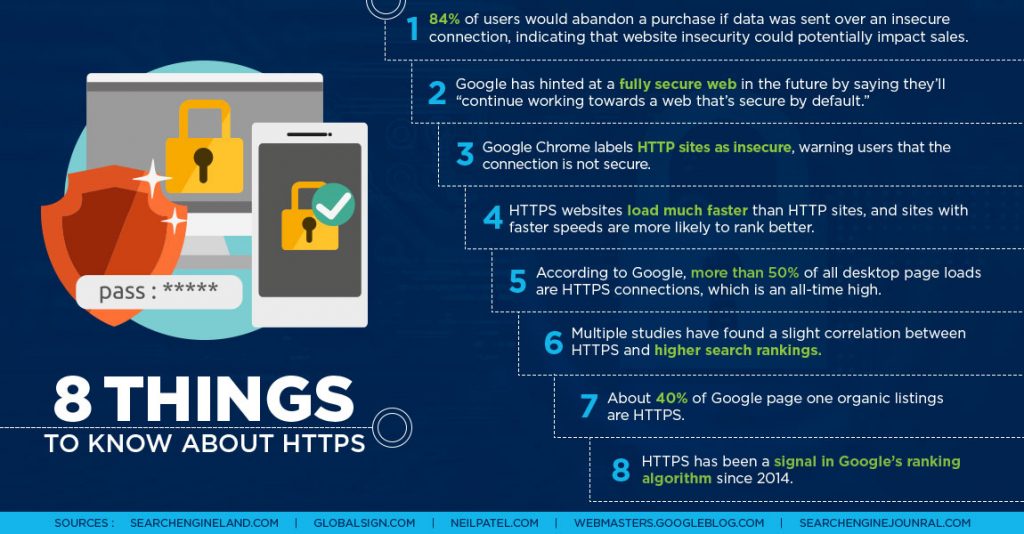
https://www.bluecorona.com/blog/https-and-seo

How fast is my page load speed?

There is nothing worse than going to a webpage and waiting for it to load. And waiting… And waiting. The truth is, the longer the load time the higher the bounce rate. An often overlooked aspect of SEO ranking analytics is the speed of a website. As a person creating a website, content is often the focus, however, the browsing experience response time of a website is key to keeping visitors engaged. Since 2010, Google has used site load speed as a factor in SEO ranking, and for most website visitors, the difference between a two and three second load time determines whether they will ever return to your site.

So know your speed and optimize it! Regularly checking page load speeds using online tools such as Google’s Pagespeed Insights, is an excellent place to start. Review the page elements to ensure that are adding load time. Enable browser caching so that repeat visitors experience faster load times. Reduce plugins to those truly contribute to the content value of your site. Remember that technical elements, while interesting and innovative, can also hurt more than help. As you explore that the new website integration, be sure to weigh each elements value against the performance of the page as a whole. And while you’re at it,  

https://www.bluecorona.com/blog/google-ranking-factors-2018

https://www.bluecorona.com/blog/https-and-seo

https://www.lyfemarketing.com/blog/seo-tricks/

https://developers.google.com/speed/pagespeed/insights/

5 WAYS TO INCREASE LANDING PAGE CONVERSIONS

While high conversion rates are the key indicator of the success of an online marketing campaign, it is the design of the landing page that the weight of that success is truly supported. With skillful design and purposeful customer interaction, landing pages are truly the powerhouse in growing conversions.

KNOW YOUR GOALS

A campaign needs focus and purpose, and these are found in your goals and displayed in your call to action. So, know your goals and keep them within view. It is difficult to lose sight of where a project started when you’re in the thick of landing page design and development. However, in order for a campaign to succeed it needs focus and purpose founded on solidly stated goals and displayed through a cleary call to action. So, know your goals, revisit them often, and as you do, ask yourself it the campaign you have meets the needs of your goals.

BOLDY EMBRACE THE VOID

The value of the voided space on a landing page is key to capturing the attention of an audience and reducing distractions for the call to action of your campaign. In this world of digital overload, customers are bombarded with advertisements at every turn, so as you seek to capture access to their minds and wallets respect the attention they’ve gifted you with. Create content for a landing page that prioritizes the most important content and make it more valuable through decluttering the content. This will both leave the customer with a clear understanding of the content and purpose of the page while also achieving the maximization of the customer’s attention and the effectiveness of the campaign. So resist the urge to fill the space and boldly embrace the void.

ASK FOR ONLY WHAT YOU NEED

It is all too tempting to ask for all the possible information you desire from a customer during a conversion, however bouncing increases with the number of fields in a form. So, when requesting customer information ask yourself not what you want, but what do you need, and restrict yourself to only that. In a world where customers are constantly having to guard data mining, gather less will make conversions more likely.

ROCK IT OR STOP IT

There is no in-between when it comes to including a video on a landing page. While there is clear and solid evidence that are amazing and powerful tools for increasing conversions, use them with skill or not at all. Placement, length, style, content, and quality all play a role in their effectiveness. They can smoothly capture the attention of the customer and to communicate a message with ease. However, be aware that, while alluring and power videos may be, they come with risk as well. Avoid pitfalls such as using videos that are too long or obscure lingo and never use autoplay. It is better to have no video at all than to have a video that is offputting to the customer. So remember, if you can’t rock it, stop it.

CLOSE WITH GRACE

As your customer leaves you, remember this is the moment you will make a final impression upon them. The way a primary conversion concludes seals the tone of the experience as a whole and sets the stage for future interactions and secondary conversions. As you design how closes remember to stay positive, grateful, and encouraging while seeking out further conversions and gathering data.