When I started my journey as a Marketing Intern for Joanna’s Nannies, I was in way over my head. I had not gotten too deep into my major-specific classes yet, and I was learning what to do day by day, project by project. Looking back seven months later, my experience has given me many more useful tools than I previously had.
Though, through my experience and classes since my first day on the job, my knowledge of marketing was still just at the surface, especially when it came to SEO, SEM, Landing Pages, Conversions, etcetera.
As I dive deeper into my journey of becoming a digital marketing wiz, I am going to share the insights I have gained through Marketing 484, the material we discuss, its correlation to my current job, and finally, the importance it plays in the marketing world in general.
The main topic of this blog is landing pages and how to increase conversions to ensure you are reaching maximum profitability. By discussing five ways to increase conversion, you will be able to increase efficiency when it comes to digital marketing.
Five ways of increasing conversion
Testing
You will not know what elements are hindering conversion if you do not conduct tests. A great way to do this is by providing prospects with the same ad but sending them to separate landing pages. Not necessarily a completely different page, but as Ryan Osman at Obility does, he provides one ad with a short-form landing page and one with long-form, including more content.
Principles of Conversion
Oli Gardner describes seven principles that can be used as a guide to ensure you are marketing campaign is successful. On a scale of delight to friction, go through each of the following areas: attention, context, clarity, congruence, credibility, closing, and finally, continence. This will give you a feel for what is working and what is not; fix what is not working, and leave what is.
Attention-Driven Design
Familiarize yourself with the 23 principles of attention driven design, including proximity, anomaly, and dominance. Going through each of these elements will increase your conversion rate tremendously. A great example comes from our website; testing proximity of what is in the radius of your Call-to-action button. Things that are in close proximity to each other are going to be perceived as being related.

Mobile-Friendly
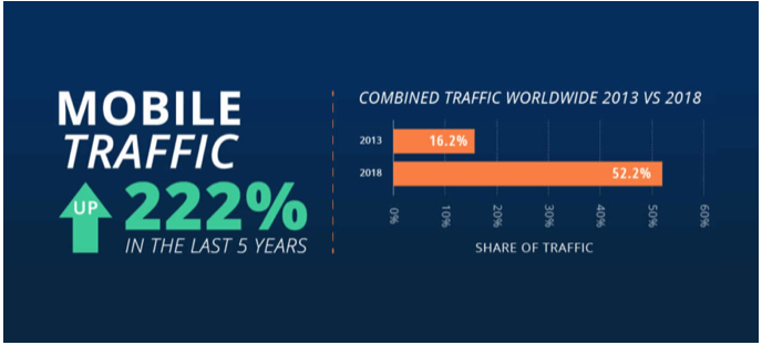
It is essential to ensure that your landing page is mobile-friendly. Mobile traffic is much higher than desktop traffic. Check out these statistics from BroadbandSearch:

A key to success is test using your mobile version, The majority of the time your desktop version will look just as good as long as your mobile version is working correctly, but that does not go the other way around! Mobile search is easy, effective and fast therefore if your page isn’t fully loaded within seconds you lost their attention and their sale.
Make a Match
You must expect that each prospect isn’t aware of who you are, what you do, and what you can offer them. That being said, you must be clear and concise with what you can offer and what you want them to do next, no confusion. The easiest way to confuse is for your advertisement not to match your landing page. Assure your product and service aligns with your message, and both of those align with each visual component. A great example of this comes from OSU in their marketing newsletter. The email matches perfectly with the landing page. It includes the same image, the same headers; I knew exactly what to expect and what I wanted to see upon clicking the link to the entire newsletter. Email on the top and landing page on the bottom.


Hi, this is a comment.
To get started with moderating, editing, and deleting comments, please visit the Comments screen in the dashboard.
Commenter avatars come from Gravatar.