Good web design is not about creating aesthetically pleasing sites but it is about generating conversions. If you are an early-stage career marketer, you need to know that the landing page has a good way to drive traffic for your brand. There are some tips for you to increase your landing page conversion rates.
Why use Landing Pages?
When you search something on your browser and click into a link, the first webpage that you can see is a landing page. A landing page is a great way to drive traffic, improve your SEO and build your brand. According to the article by Cheryl Baldwin, director of Marketing & Communications in WSI, approximately 68% of B2B businesses use landing pages to generate leads for future conversion. Thus, when you have done a good job to build your brand and create a website, the next movement for you is to make sure that your landing page has a good way to drive traffic for your brand. Landing pages are absolutely a good way to go when you are seeking for an effective lead convention tool.
Higher conversion rates mean more of your organic traffic turns into leads, and it also helps cut your ad costs because more of those clicks are becoming leads.
#1. Optimize your landing page ad copy for mobile devices.
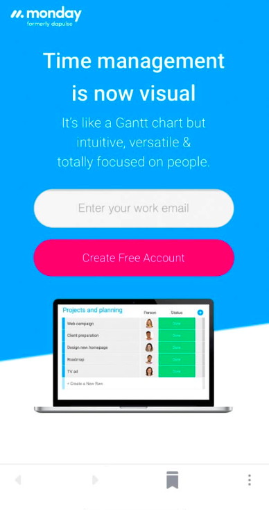
The first step to optimizing your ad landing pages for better conversion rates is making sure they look good on mobile devices.
- Make sure your headline and sub-headline fit nicely above the fold.
- Correct any words or sentences that are cut off or appearing in odd places.
- Make your key information immediately visible to the user.
Here is an example of a good landing page :

When making decisions about the content arrangement for mobile and desktop, designers need to also be aware of differences in needs between mobile and desktop users.
- Mobile users are less likely to make a purchase on their phones
- They might look for the physical store to make the purchase.
# 2. Keep it simple
Keep your landing page simple is a good way for your visitors to get your point.
- Your page should rely on simple bullets, not paragraphs, to communicate the trial’s details and benefits.
- There are just a few fields you need to fill out before you get started, such as email address.
#3. Color design is important
Color design is very important in optimizing your landing page. Science tells us that color elicits emotion which can result in negative or positive feelings. In a peer-reviewed journal article, Satyendra Singh determined that it takes a mere 90 seconds for a customer to form an opinion about a product. And 62–90% of that interaction is determined by the color of the product alone.
recommended reading: https://neilpatel.com/blog/psychology-of-color-and-conversions/
#4. Adding appealing images.
Visuals are the emotional foundation of your landing pages. They have the power to make your visitors walk away feeling happy, informed, motivated or reassured. And most importantly – they have the power to boost your conversions. But how exactly can you incorporate visuals into your landing pages? Unsurprisingly, there are lots of ways to use visuals – like images, videos, and even GIFs.
Images have the dual benefits of capturing attention and amplifying your message, while also being easy to use and fast to load. And page load times are a big deal for user experience! Throw in the fact that images are readily available, easy to edit and cost next to nothing to produce (when compared to video), and you can see why they are the mainstay of landing pages.
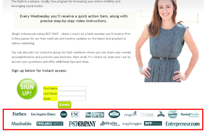
#5. Display trust symbols.
Establish credibility by displaying trust symbols like awards and accolades, or any other credentials your website or brand have. If you’ve worked with any leading brands, add their logos to your page.


