1. Description of Research Question

Disease transmission is intrinsically tied to space use and behavior: Individuals are exposed to pathogens based on where and with whom they spend their time. I will explore how different spatial personalities may affect individual disease risk and herd disease dynamics in a social species. For this project, I will specifically examine individual realized aggregation (IRA), or the degree to which different individuals in my study system aggregate with others, and will relate IRA to risk of exposure to directly transmitted diseases. To explore this question, I will make use of a unique study system of GPS-collared semi-wild African Buffalo (Syncerus caffer) located in Kruger National Park (KNP), South Africa.

IMG_3439


2. Description of Dataset

The dataset I will be analyzing consists of approximately eight months of GPS readings from each of the 70 individual buffalo in the herd, collected at ~30 minute intervals. Accuracy tests have yet to be performed, but GPS collars should have at least 5-10 meter accuracy range. The map below shows the 900 hectare enclosure which serves as the study area.

boma

For a project in a previous class, I created tracking animations using a subset of data from a single individual during a 24-hour period. Output from the tracking tool is shown below. This output shows that we can distinguish between periods of high movement (i.e. tracks are far apart) versus low movement (tracks close together) for each individual.

Screen Shot 2016-03-11 at 9.08.07 PM

3. Hypotheses

I hypothesize that individuals will have different spatial behavioral personalities, demonstrated by the maintenance of relatively stable differences in IRA. This hypothesis is based on previous field observations, suggesting that individuals maintain stable herd positions over time. I further hypothesize that individuals with high IRA will be exposed to more directly transmitted diseases than those with low IRA.

4. Approaches

I expect that the approaches I take will evolve throughout the course of this project, but currently my plan is as follows:

My first step will be putting the buffalo movement data in the correct format. Currently, I have separate text files of GPS readings for each individual buffalo over each capture period. I will need to combine all individuals into a single spreadsheet for each capture period in order look at relative positions of individuals within the herd. I will then sample time points from across the capture period (controlling for weather conditions and time of day) and generate 5, 10, 15, 20, and 25 meter buffers around each buffalo. I will use the buffer zones to calculate number of individuals within each radius and determine the degree of IRA for each individual. I will then compare IRA to disease exposure and infection data collected as part of a larger Foot-and-Mouth Disease Virus study to determine whether there is a relationship between exposure/infection and IRA. Because this is such an extensive dataset, I hope to be able to automate the process of generating buffers around each buffalo at each time point using programming in ArcGIS.

5. Expected Outcome

I want to statistically evaluate IRA for each individual buffalo and produce graphs of average number of neighboring individuals per radius size for each individual. I also hope to statistically evaluate relationships between directly transmitted disease exposure and IRA.

6. Significance

Understanding disease dynamics in social mammals is of fundamental importance in the current context of accelerated infectious disease emergence. Owing to a uniquely tractable study system, this work will be the first to categorize individual variation in spatial behavior and link it to disease risks and transmission dynamics.

This work has implications for predicting and managing animal and human diseases. If key individuals for disease transmission can be identified based on spatial-behavioral traits, efficacy and efficiency of disease control could be optimized via targeted interventions.

7. Level of Preparation

I have moderate experience in GIS and statistical analysis in R. I have completed ST 511 and 512 (Methods of Data Analysis), and for a current side project I am using R to analyzed blood chemistry parameters using linear mixed models. I have taken two GIS courses: Geo 565 (Intro GIS) and Geo 580 (advanced GIS) and have used subsets of my data for projects in both of those courses. However, I definitely am not an expert in either GIS or R and will need help navigating both programs.


  1. Description of Research Question:

The Oregon Coast Range routinely plays host to disastrous landslides. The primary reason for these landslides is that the range provides a unique combination of high annual precipitation with the presence weak marine sediments (Olsen et al. 2015). During winter storms, it is not uncommon for major transportation corridors to become inoperable, impacting local economies and the livelihoods of residents (The Oregonian 2015a, 2015b). Overall, landslides in Oregon cost an average of $10 million annually, with losses from particularly severe storms having cost more than $100 million (Burns and Madin 2009).

While these rainfall-induced landslides may sometimes be large, deep-seated failures, they most frequently occur in the form of shallow translational failures. These shallow landslides typically occur in the upper few meters of the soil profile, and may result in heavy damage to forest access roads or the temporary closure of major roads.

Recently, I developed a limit equilibrium slope stability model for use in mapping shallow landslides during rainfall. In its current form, the model a deterministic equation that computes a factor of safety against failure for each cell of a digital elevation model (DEM). The problem with this approach is that if fails to account for spatial and temporal variation of input parameters and it only considers a single DEM resolution. My research question is to explore how the incorporation of a probabilistic framework, which expresses the confidence in each input and multiple scales of application, influences the predictive power of the model.

  1. Datasets:

The dataset analyzed for this project consists of three parts:

  1. Data from Smith et al. (2013), who performed hydrologic monitoring of a clear-cutted hillslope in the Elliot State Forest of southwestern Oregon. Monitoring was performed over a three year period, with measurements of rainfall, volumetric water content, and negative pore water pressure taken at hourly increments. Volumetric water content and negative pore water pressure were measured in eight separate soil pits, with each pit being instrumented three times between 0 and 3.0 meters in depth.
  2. Lidar derived DEM from the Oregon Lidar Consortium for the Elk Peak quadrangle in southwestern Oregon.
  3. The Statewide Landslide Information Database for Oregon (SLIDO) corresponding to the Elk Peak quadrangle.
  1. Hypotheses:

The existing model, despite being insufficient to meet the goals of this project, has provided valuable insight into the influence of rainfall on slope instability. Like other slope stability methods, topography and soil strength will account for most of the stability. These two factors combined are expected to bring soils to a critical state, but not a state of failure. The addition of rainfall will then determine whether slopes fail or not. This approach should be most interesting when using the model to forecast landslide hazards based on predicted weather.

  1. Approaches:

I am not clear on exactly what types of analyses need to be undertaken to further my project. My hope is that the advice from peers and assignments associated with this course will help me choose the necessary steps, given my set of goals. I anticipate that most work will be performed in either ArcGIS or Matlab.

  1. Expected outcome:

This project is expected to produce a statistical model that estimates the probability of failure for a given set of conditions. The model is intended for use in mapping applications, and the primary outcome will be rainfall-induced landslide hazard maps for the Elk Peak quadrangle.

  1. Significance:

Accurate hazard maps allow land managers and homeowners to better understand the risk posed by landslides. This method is expected to go a step forward by using rainfall predictions to produce pre-storm maps, which will provide hazard maps specific to a severe rainfall event. Maps of this nature would be especially important because they would allow agencies like the Oregon Department of Transportation to know where resources might be needed before any damage has actually occurred.

  1. Your level of preparation:
    1. I have extensive experience with ArcGIS and model builder from coursework and research during my master’s degree. I have also served as a TA for the OSU CE 202 course (a civil engineering course on GIS), which gave me greater abilities in troubleshooting ArcGIS and working with Modelbuilder.
    2. My experience with GIS programming in Python is moderate, and mainly the resulting of taking GEO 578.
    3. I have no experience with R.

References

Burns, W.J., and Madin, I.P. (2009). “Protocol for Inventory Mapping of Landslide Deposits from Light Detection and Ranging (LIDAR) Imagery.” Oregon Department of Geology and Mineral Industries, Special Paper 42.

Olsen, M.J., Ashford, S.A., Mahlingam, R., Sharifi-Mood, M., O’Banion, M., and Gillins, D.T. (2015). “Impacts of Potential Seismic Landslides on Lifeline Corridors.” Oregon Department of Transportation, Report No. FHWA-OR-RD-15-06.

Smith, J.B., Godt., J.W., Baum, R.L., Coe, J.A., Burns, W.J., Lu, N., Morse, M.M., Sener-Kaya, B., and Kaya, M. (2013). “Hydrologic Monitoring of a Landslide-Prone Hillslope in the Elliot State Forest, Southern Coast Range, Oregon, 2009-2012.” United States Geological Survey, Open File Report 2013-1283.

The Oregonian (2015a). “U.S. 30 closes and reopens in various locations due to landslides, high water.” December 17, 2015. <http://www.oregonlive.com/portland/index.ssf/2015/12/high_water_closes_one_us_30_ea.html>

The Oregonian (2015b). “Landslide buckles Oregon 42, closing it indefinitely,” December 25, 2015. <http://www.oregonlive.com/pacific-northwest-news/index.ssf/2015/12/landslide_buckles_oregon_42_cl.html>

Research Question
Are magnetic properties such as susceptibility related to heavy metal concentrations at the Formosa Mine Superfund Site? What sort of environmental factors contribute to the distribution of heavy metals in the affected area?
Data Set
The data consist of heavy metal concentrations, obtained with a portable X-Ray fluorescence gun (pXRF) as well as magnetic susceptibility at both low and high frequencies (0.4 and 4.7mT). Samples were taken semi-randomly from the Formosa Superfund Mine site and nearby streams, Middle Creek and Cow Creek. Samples were taken from areas that were accessible but also at random along trails and near site features such as the adit diversion system and identifiable seeps and drainage routes along roadsides at the site. Samples were divided into 4 fractions; bulk, >63µm, between 20-63 µm and <20 µm. These samples were then dried in an oven at 40C and then prepared for pXRF and magnetics measurements.
Hypothesis
Magnetic properties will show correlation with heavy metal concentrations because heavy metals tend to associate with magnetic minerals. Various environmental factors related to generation of acid rock drainage and hydrology will account for the distribution of certain metals in the affected area.
Past research has shown strong correlation between certain magnetic parameters and heavy metal concentrations. Magnetic techniques have been used to identify and delineate polluted areas in a number of applications from mapping atmospheric deposition of fly ashes to determining sources of contamination in urban environments (Lu and Bai, 2006). Furthermore, a Pollution Loading Index (PLI) can be calculated from the cumulative addition of all metals. PLIs are often well correlated with magnetic parameters. At this particular site, the main concern is acid rock drainage and the subsequent transport of heavy metals to streams nearby.

Approach
As this is the exploratory stage with respect to this data set, various methods were employed to categorize and organize the data. Much time was spent combining data from a number of sources including the susceptibility meter, pXRF and GPS used to store waypoints. Once in a usable format, waypoints and data were transferred into ArcGIS for hot spot analysis and general mapping needs.
Results
Hotspot Analysis
The hotspot analysis revealed that heavy metals are indeed found in greater concentrations at the Formosa Superfund Site. At this point, there is only one point that is not ‘hot’, and as such it represents a benchmark for comparison of other samples. Further sampling is required to properly delineate the zone of influence and to assess the degree and extent of contamination to nearby surface waters; Upper Middle Creek and South Fork Middle Creek.
Exploratory Regression
Once the magnetics data were properly normalized for mass and volume, they revealed some interesting correlations with heavy metals. In particular, Mn and V showed strong positive correlations with both low and high frequency susceptibility.
It is expected that additional data will smooth out some of the relationships. With so few points, it is difficult to assess variability and error in the data.
Pearson Correlation Coefficients
Correlation coefficients were calculated for all metals and magnetic susceptibility in both low and high field magnetization. The following pairs of variables were highly correlated (ie. had p-values less than 0.05): Ca and Zr, V and Ti, Fe and Cu, Fe and Zn, Fe and As, Cu and Zn, Cu and As, Zn and As and Zr and Ta. This suggests association of various metals with each other and in the case of Mn with high frequency susceptibility. Of particular interest are the metals correlated with Fe. Most magnetic minerals have Fe and hence these relationships are the most likely to be further elucidated by magnetic measurements. Additional data may yield stronger or weaker correlations between variables. This is yet to be determined.

Principal Component Analysis
PCA is meant to group components (factors) in a way that describes the maximum variance in a data set and hence each factor carries a weight associated with that variability. In this initial analysis, the majority of the variance is accounted for in the first 4 components (see Table 1). The weightings of factors for each component are listed in Table 2.
Table 1= Eigenvalues and percent variance covered by each principal component in analysis of sediments from Formosa Superfund Site

pca_components

The first component is difficult to interpret. The weightings are low and tend to the negative, showing inverse relationships explain much of the variability in the data. In the second component there is evidence for explanation of variance based on magnetic parameters. The third component shows even stronger evidence of variance explained by high field susceptibility. This has implications towards understanding the mineralogy that drives the magnetic signal. Further correlations with heavy metals signifies important relationships between magnetic minerals and metal contaminants.

Table 2- Weighting of factors for first 4 components of PCA of sediments from Formosa Mine Superfund site
pca_eigen
This third table associates the various components with their spatial location, identified by the labels in column 2. Further analysis would map these components to show the spatial aggregation of variables, giving further clues on environmental factors that drive them.
Table 3- Association of sample points with component drivers

pca_site

Significance and Further Direction
The significance of this research lies in its capability to quickly assess the degree and extent of anthropogenic pollution. To date, magnetic techniques have been employed over a diverse range of applications and landscapes. Further expansion of applications is desirable from many perspectives. Having quick, easy ways of determining hot spots of contamination focuses reconnaissance on areas that are most affected and/or vulnerable and better affords important resources to be allocated towards clean up and mitigation.
At this point, it is impossible to make definitive conclusions about this analysis. More data are needed and there are some considerations to be made with respect to the methodology in analyzing the samples to begin with. Aggregation of particles and association of magnetic materials with organic matter are just two considerations that need to be addressed before further processing and analyses are done. Cross-reference with EPA and BLM data would be a useful endeavor as well. There are many opportunities for expansion and collaboration on this project which should be pursued at this time.

Learning Outcomes
-ArcGIS likes easy to read files- be careful with file names, pathways and column headings
-I learned Statgraphics—It’s an easy tool to use with no language barriers. It’s like a stand-in for quick analysis
– I made zero progress on Python, Modelbuilder or R (which I haven’t used in so long that I feel I need to start from basics again)

Reference
Lu SG, Bai SQ. 2006. Study on the correlation of magnetic properties and heavy metals content in urban soils of Hangzhou City, China. Journal of Applied Geophysics 60 : 1–12. DOI: 10.1016/j.jappgeo.2005.11.002

Hello, Geo 584 readers!

In my previous blog post, I mentioned my main goal was to use statistical analysis including environmental variable mapping and spatial interpolation methods to quantify correlations between harbor porpoise movement patterns and distributions with biophysical variables.

However, to do all of this, I had to see exactly what kind of data I was working with. Over the previous two years I have collected spread sheet after spread sheet of survey effort, ship transect lines, marine mammal sighting data, oceanography data, acoustic data, and stranding data. This was my first chance to dive in and look at what all I was working with.

Step 1: Sort out all marine mammal sightings – this proved to be much more tedious than I thought J

Step 2: Plot all longitude and latitude gps points of sightings on a base map

Note: This is where the ship was when the marine mammal was spotted, not necessarily the exact location of the animal.

Step 3: Map a typical day of transect surveys from each of the three survey sites

Step 4: Add course bathymetry layer to the map – and add a 200m depth contour line

Note: Much as the name implies, Harbor Porpoise tend to be a near-shore species not typically inhabiting waters deeper than 200m.

Step 5: Distribution analysis using Arcmap tools – goal was to see if harbor porpoise had an overall different distribution vs all other marine mammals seen. My hypothesis was that harbor porpoise would have a more inshore distribution.

Results:

points

This was a map of my sightings based on the boat gps, again, this is not exactly where the animal was. This requires more triangulations and calculations which I will be taking a course on in August! So I wanted to save that analysis for then!

Picture3

This second image is a map of a typical day of transect surveys in each of the three sites. I decided to do this because if you look at the sightings along you tend to see a funky pattern, but this is mainly due to the layout of the transects.

hotspot

This third image has an added 200m depth contour line, again, this is because harbor porpoise ecology states that they tend to be a near shore species. The two ovals represented in this figure are the distributions of harbor porpoise in yellow vs all other species in green. The odd shape is due to the NH line of the surveys going about 15 more miles offshore than the other two. But it is easy to differentiate that harbor porpoise generally have a more inshore distribution as I predicted.

Walking through these steps was exciting for me this was my first chance to see visual representations of my data as well as learning GIS with using correct projections and distribution calculators.

What’s next – Plans for the next few weeks!

  1. Begin to focus only on harbor porpoises. I chose harbor porpoise for my indicator species for my thesis because they are abundant, sound sensitive, and most likely to overlap with marine renewable energy.
  2. Find fine scale layers: bathymetry, bottom type, etc. Using a basemap is great to look at the data visually, but it is hard to make any interpolations or statistical analysis without environmental covariates.
  3. Coordinating sightings vs effort: take into account unequal transects, length of transect line vs. odds of seeing porpoise
  4. Organize in-situ flow through oceanographic data collected concurrently with transect lines and then use spatial interpolation to create a fluid shape file of sea surface temperature, salinity, and chlorophyll a.
  5. Are environmental covariates determining distributions? SST, Distance to Shore, Depth, Season? What are driving these porpoise occurrences?

As you can see, I have plenty to work on! Thanks for reading!

The spatial problem I explored this quarter was about quantifying the extent of the foraging ranges of Adelie and Gentoo penguins breeding at Palmer Station, Antarctica. My original research question was whether interspecific competition could be a possible mechanism driving penguin population trends at Palmer Station. In retrospect, this question was a bit beyond the scope of the spatial analysis I proposed to conduct. However, the approach I used to test my hypothesis (that the foraging ranges of these two species would overlap) is an important first step in starting to answer this question.

The dataset I used to conduct this analysis consisted of location data (Lat/Long coordinates) obtained from platform terminal transmitters (PTTs). Over the course of the 2015 breeding season (5 January-2 February), 20 penguins (n=5 Adelie, n=15 Gentoo) were outfitted with PTT tags for roughly 3 days each. Over these three days, tags transmitted location data to ARGOS satellite system. With the specific purpose of learning spatial analysis techniques in mind, all datapoints were treated as foraging locations. Further analysis of PTT data combined with TDR (time depth recorder) data would need to be conducted in order to separate foraging locations from travelling locations. Location data from individual birds were grouped together by species (n=522 Adelie, n=147 Gentoo). The purpose of this was to analyze each species foraging distribution as a whole rather than look at individual tracks.

I used a kernel density (KD) approach to answer my question of interest. I chose this approach because it is one of the most widely used techniques to apply to tracking data for hot spot analysis, and because it appeared to be relatively easy and quick to learn. My goal was to create isopleths of utilization in order to identify areas used for foraging (95% KDE) and core use areas (50% KDE). The general idea being that the area contained within the 50% contour line would be the smallest area encompassing 50% of the datapoints used to create the entire KDE. I also sought to determine the area (km²) within of each of these contour lines and calculate the proportion of overlap between the two species ranges.

My results are summarized in table 1 (below). Gentoo penguins have a larger foraging range (core use and overall) concentrated around the colony where they were tagged, as well as near the head of Palmer deep canyon (figure 1). Adelie penguins have a more densely concentrated (near shore) range centered around the colonies where they were tagged. These results provide evidence to support my hypothesis that the ranges of the two species overlap. A greater percentage of Adelie foraging area overlaps with Gentoo area, due to the fact that their range is smaller.

1

Table 1. Estimates of core use (50% KDE) and total (95% KDE) foraging areas used by Adelie and Gentoo penguins with associated overlap between species.


Picture1


Figure 1. Map depicting kernel density contours for 95% and 50% KDEs. Dark blue and red symbolize overall and core use areas of Adelies and lighter blue and red represent Gentoo ranges.

The significance of these results is questionable due to issues I was unable to address by the end of the quarter. Kernel density estimates are influenced significantly by the smoothing factor (search radius) used, which in turn is influenced by the density of datapoints considered. Therefore, sampling size, or the number of datapoints used in each kernel density estimate, has a big effect on the final KDEs. In this analysis, I used a much larger sample of Adelie locations then I did Gentoo locations. I have begun testing the effect of sample size on these KDEs, but have yet to come to any conclusions about the appropriate number of datapoints to use in order to gain an accurate estimation of foraging range.

Once I’ve addressed this issue of unbalanced sampling, I will be more confident in drawing conclusions about the foraging ranges of these two species. In the future I intend to use this information to make comparisons of these ranges between species and across years of variable prey. Ultimately, this knowledge will inform larger questions of the Palmer Long Term Ecological Research (LTER) project (e.g. how do changes in the marine environment affect the behavior and distribution of penguins? Are penguins competing with each other and/or other krill predators (e.g. whales) in the Palmer area? How does prey variability affect these relationships?).

Over the quarter I’ve gained more knowledge of ArcMap, specifically the spatial analyst toolbox and the kernel density tool. I’ve also begun to learn these same techniques in R and I hope to continue to expand on that in the future.  Thanks Julia and Mark!

Since my last update I’ve made significant progress in estimating the foraging ranges and overlap between Adelie and Gentoo penguins at Palmer Station over the 2014/15 breeding season.

With the help of a classmate (thanks Steven!) and a few online forums (GIS in Ecology & GIS 4 Geomorphology), I was able to figure out how to calculate kernel density estimates (KDE) without Arc’s outdated Animal Movement Extension or Hawth’s Analysis Tools.

Objective: Quantify the geographical extent of the distribution of Adelie and Gentoo penguins foraging around Palmer Station

  • Create kernel density estimates to identify areas used for foraging (95% KDE) and core use areas (50% KDE)
  • Calculate the area (km²) within 95% and 50% kernel density contours
  • Calculate the % overlap between the ranges of Adelie and Gentoo penguins

Methods:

  1. Filter data points whose estimated error is >1500m
  2. Combine location data points for all Adelie (ADPE) individuals n=15 (522 data points) and all Gentoo individuals (GEPE) n=5 (147 data points)
  3. Create kernel density estimates using the kernel density tool and default parameters
  4. Extract values by points from the output obtained above, determine 50% and 95% of observations using values of extracted points from attribute tables
  5. Reclassify kernel density raster so values >50th percentile have a new value of 50 and all others have a new value of NoData, use the same steps to create additional rasters representing 95% of points
  6. Convert rasters to polygons, calculate area of each polygon using calculate geometry tool
  7. Use union function to determine area of overlap between polygons

Results:

1


Table 1. Estimates of core use (50% KDE) and total (95% KDE) foraging areas used by Adelie and Gentoo penguins with associated overlap between species.

2Figure 1. Visual representation of Adelie core use (red) and total foraging area (pink) and Gentoo core use (dark blue) and total (light blue) foraging areas. Despite poor image quality it is obvious that these ranges are closely associated with the colonies that the respective species are from, and there appears to be some association with bathymetry as the range of Gentoo’s is dense at the head of Palmer deep canyon.

3

Figure 2. Close up visual representation of Adelie core use (red) and total foraging area (pink) and Gentoo core use (dark blue) and total (light blue) foraging areas. Despite poor image quality it is obvious that these ranges are closely associated with the colonies that the respective species are from, and there appears to be some association with bathymetry as the range of Gentoo’s is clustered at the head of Palmer deep canyon. Note overlap between species.

Discussion:

The results of this analysis indicate that Gentoo penguins occupy a larger foraging range (core use and overall) and because of this, the portion of their range that overlaps with that of the Adelie penguins is minimal to moderate. The opposite is seen in Adelie penguins, who appear to have a smaller foraging range and thus a higher proportion of it overlaps with Gentoo penguins. Also notable is the fact that Gentoo penguins appear to be foraging farther away from their colony than Adelie penguins, which is surprising as the opposite is usually true. The main caveat of these results is the difference in sample size between data points of Gentoo (n=147) and Adelie (n=522) penguins. This was not accounted for in this analysis and is likely skewing these results. The fact that Gentoo’s have a larger range could be because there were fewer data points used in the creation of the KDEs.

The next step in this process will be to research methods that take sample size into account. One possibility is taking a random sample of Adelie location points from the total sample so that Adelie’s are represented equally to Gentoo penguins.

I will also be experimenting with KDE in R. This will allow me to compare results between the two methods (and R should speed this process up down the road)!

I am also in the process of determining whether a bathymetric layer and/or accurate basemap exists for this region. So far I’ve had difficulty finding these things but they would be very useful to compare these results to co-variates such as bathymetry and distance to shore.

I conducted a hot spot analysis for the cackling goose use of the Willamette Valley. As previously mentioned, I was curious how the geese are using the area throughout the winter season (October – April). I conducted a hot spot analysis for for each month using location points from the entire time series, 1997-2011, to attempt to discern any changes in landscape level use of the valley throughout the winter. All the maps passed the common sense test (the clusters were right over the refuges, no floating hot spots, etc.) which was somewhat heartening.

My first step was separating the data into month files and creating maps of each month in Arc. I also had not seen the data before, so it was nice to pull the points into Arc finally.

CACG

Cackling goose flock locations throughout the Willamette Valley, Oregon from 1997-2011.

Secondly I ran hot spot analyses on each month and compared. The hot spots were centered on the four federal refuges in the valley, Finley, Ankney, Baskett, and Sauvie Island (from south to north). Most of the winter months looked more or less the same, except the beginning and end of the winter season.

October vs. November

Oct-Nov

March vs. April

Mar-Apr


The addition of two hot spots between October and November, and the loss of one (Sauvie Island) in April likely reflects what sort of agriculture timing the refuges are on, but I am working on exploring why these particular locations are/are not used in those months.

My goal in this course is to create a sort of ‘analytical recipe’ for dealing with the extensive data set I’ve accumulated over the past couple years. I am interested in using the magnetic properties of sediments as proxy for mapping heavy metal concentrations. Magnetic measurements are fast, non-destructive and require little to no preparation. As such, they present a possible replacement for expensive and time consuming geochemical analyses. Less money and less time on monitoring means more money and more time for remediation. Magnetic measurements also yield information that is not acquired in general geochemical approaches such as dominant mineralogy.
The data I will be analyzing consists of measurements for the following properties: magnetic susceptibility (high field, low field and frequency dependence), anhysteric remnant magnetization, isothermal remnant magnetization, various derived ratios and heavy metal concentrations taken using a portable x-ray fluorescence gun. Samples have been taken semi-randomly from the abandoned mine which spans an area of approximately 75km2 and also from nearby streams; Middle Creek and Cow Creek. There is no temporal dimension to the data…yet.
Here are a couple of maps showing sampling points and location of the mine.

formosapoints

location

Here are a couple pictures of the site showing the encapsulation mound and surrounding area. What a lovely view from such a degraded place.

encapmound downencapmoundhappysampling


It will be necessary to correlate various magnetic properties with heavy metal concentrations for different grain sizes. The end product will be statistical relationships that describe the correlation of specific properties with the concentration of various metals. It is highly likely that not all metals of concern can be inferred from magnetic measurements. It will be interesting to see which metals, if any, can be mapped using magnetic approaches. The end map could show concentrations of specific metals mapped as weighted circles for each point that was sampled. For statistically significant correlations, maps could be produced to show how the magnetic measurements relate to concentrations as a side-by-side comparison. Other suggestions are welcome for this.
It is expected that specific metals will associate with various magnetic properties and that the concentration of metals will be highest in areas that are closer to drainage ways and extraction sites.

UPDATE
I have been successful in mapping some of the metals data in ARCMap, however Hot Spot Analysis has been giving me errors. There are obvious hot spots for nickel which is to be expected as nickel is prevalent in this area. The map for copper shows no significant hotspots. There are likely ecological and physical explanations for this lack of copper. It was one of the metals mined at this site.
The first image shows hotspots for nickel and the second one shows copper.

Ni Cu

I have included a screen shot of my error message. If anyone has any suggestions, please let me know.

error

As stated in previous posts, the goal of my project is to explore the difference between point-source temperature recordings at NOAA monitoring stations and the land surface temperature images made available daily from the NASA MODIS satellites. As a first step in comparing these datasets, hot-spot statistics and spatial autocorrelation were used to identify any areas where the difference between the data was significantly non-random. The steps below outline this process.


Data Selection and Cleaning

To begin exploring the data, I selected a single day (January 1, 2015) and linked the measurements from both sources into one shapefile. The NOAA data were downloaded as a CSV file from the NOAA National Climate Data Center (http://www.ncdc.noaa.gov/). This data arrives as a mostly cleaned CSV and the only transformation required was to convert the temperature readings from tenths of a degree Celsius to degrees Celsius. The MODIS raster image was downloaded from the USGS Earth Explorer engine (http://earthexplorer.usgs.gov/) and required some work before it could be used. The raster was re-projected from the unspecified cylindrical projection used for MODIS products to WGS84 to match the point shapefile using the ‘Project Raster’ tool in ArcGIS (http://help.arcgis.com/en/arcgisdesktop/10.0/help/index.html#//00170000007q000000).  Once re-projected, the image then had to be re-scaled and converted from Kelvin to Celsius [OutRaster = ((InRaster * 0.02) – 273.16)] before being used.


Joining the Data

Once both data sets were cleaned and ready to be used, the two were joined together for analysis. This was done using a custom Python script, however the ‘Extract Values to Points’ tool in ArcGIS (http://help.arcgis.com/en/arcgisdesktop/10.0/help/index.html#//009z0000002t000000.htm) or QGIS completes the same task. The final shapefile contained a point for each monitoring station with fields for the NOAA and MODIS values along with the difference between the two represented as the absolute value of the MODIS value minus the NOAA value (Difference = |MODIS – NOAA|). This difference figure is what is used for the analysis.


Hot-Spot Map in ArcGIS

The next step was to create a hot-spot map of the difference figures to identify any areas of significantly greater or less difference. This was done using the ‘Hot Spot Analysis’ tool in ArcGIS (http://resources.arcgis.com/en/help/main/10.1/index.html#//005p00000010000000). In the image below, we can see that there is an area of greater difference in central Oregon and an area of less difference near Portland.

hotspot

It is important to note that neither of these are significant, and most likely represent differences in the terrain. I suspect that the area of higher difference in central Oregon is due to the fact that fluctuations in temperature are much greater there than in the valley. Furthermore, the temperature in the area of less difference is more stable and therefore would not be as prone to error. It is important to remember that the NOAA data represent daily temperature averages, while the MODIS data represent the land surface temperature at the specific time when the image was taken. To explore this idea further, future analysis will include some variable to account for location or land-use type.


Spatial Autocorrelation

Finally, the Moran’s I statistic was calculated to further explore if there is any significant spatial autocorrelation in the difference measurements. This was done using the ‘Spatial Autocorrelation’ tool in ArcGIS (http://resources.arcgis.com/en/help/main/10.1/index.html#//005p0000000n000000). The output is shown below:

modis_moransi

moransi_value

This statistic showed that there is no significant spatial autocorrelation. The combination of the very low Moran’s I and the high P-value lead to the conclusion that the difference figures are randomly dispersed throughout the points.


There are some areas in the map that have very high difference on this one day. The next step is to explore these data over a larger time frame to see if the pattern of the difference is the same or different. I plan to download data for at least a few days from each month of 2014 and explore the spatial pattern of the difference between each data set.

I will (hopefully) be exploring two different data sets in this course. My MS work (described in another post) does not contain any spatially explicit points, so work with programs like Arc becomes more difficult. For several of these analyses I will be using a dataset from the Oregon Department of Fish and Wildlife of cackling goose flock locations.

Cackling geese (Branta hutchinsii minima) are small-bodied geese in the Canada/cackling goose complex (http://www.sibleyguides.com/2007/07/identification-of-cackling-and-canada-goose/). The cackling goose is a is a migratory, Arctic breeding goose with breeding range primarily in the Y-K Delta of Alaska and wintering primarily in Oregon and Washington. Cackling geese are now the most abundant goose species wintering in the Willamette Valley. This follows the general explosion of most Canada goose and cackling goose populations in North America starting around 1966, but the range shift seen in cackling geese is unique coupled with the drastic increase in population size. The cackling goose has increased in number dramatically from an all-time low of less than 20,000 counted in fall surveys during the winter of 1984-85 to over 200,000 birds currently. Along with this population increase has come a change in winter distribution with significantly more use of Oregon and Washington instead of the Central Valley of California, with most birds being found in Oregon’s Willamette Valley and lower Columbia River. To reduce agricultural crop depredation, Oregon refuges have switched to habitat management practices to try and draw cackling geese onto refuge lands. There are also special hunting periods throughout the winter that may influence how flocks use available habitat. Interestingly, cackling geese have consistently been observed increasing their use of urban habitats such as golf courses, parks, sports fields, and residencies.

These birds have been collared on an individual basis since the mid-1990’s. While these data are used largely for mark-recapture analyses to gauge population size, it also produces a large number of flock locations throughout the winter within the Willamette Valley region. Within Oregon, the data spans 1997-2011 and contains 3,141 flock locations with associated latitude/longitude information. These data have been gathered opportunistically by state and federal personnel, and require a bit of data management beforehand.

Using these data, I hope to explore 1) if flock use has changed over the last 20 years, 2) if flock use changes throughout the winter, 3) what habitats feature flocks are most often using (refuge, agricultural, urban), and 4) if flock size changed over time or is influenced by habitat type.

To approach these questions, I would like to conduct several comparable hot spot analyses. I would like to produce a series of maps to provide to ODFW. Understanding flock use is important for resource managers as the population increase pushes birds into private agricultural and urban regions, and if use is changing over time.

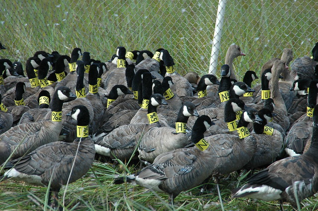
Holding pen full of collared cackling geese